Deliverable
Mobile Application
Tools
Sketch and Principle
Frequent international travelers struggle to manage jet lag effectively, with limited tools offering proactive, personalized solutions to ease the transition across time zones.
Design a simple, guided mobile experience that helps users gradually adjust their circadian rhythms before and during travel, improving sleep, focus, and productivity abroad.
Acclim8s is a conceptual mobile app designed to address the challenges of travelers adjusting to new climates, particularly the physical and mental effects of jet lag and sudden weather changes. Despite the abundance of travel apps, none provided a comprehensive solution that combines personalized acclimation plans, location-based insights, and real-time weather and health data to help travelers prepare efficiently. This app fills that gap by providing curated resources like packing lists, acclimation tips, local weather, and much more in one platform.
The idea originated from the insight that while jet lag affects millions of travelers every year - from business professionals to frequent leisure travelers - there are very few tools specifically built to proactively manage this issue.
Most existing solutions are reactive (sleep aids, melatonin, sleep tracking), leaving a gap for a product that guides travelers through gradual, evidence-based adjustments to their sleep, light exposure, hydration, and activity routines.
• User interviews
• User goals
• User persona
• User journey
• Competitive analysis
• Low fidelity
• Wireframes
• Information architecture
• Screen flows
• High fidelity
• Interaction prototype
• Usability test
• Usage tracking
• Documentation
• Q & A testing
• User testing
• Feedback
To validate the concept and uncover pain points around jet lag management, I conducted primary qualitative research through user interviews and a short survey.
This research directly shaped the app’s onboarding flow, scheduling features, and wellness content strategy.
• Understand how frequent travelers currently manage jet lag
• Identify gaps in existing tools and behaviors
• Explore user openness to proactive acclimation guidance
• 8 frequent international travelers (5 business, 3 leisure)
• Ages 25–43, traveling across 5+ time zones at least twice a year
• 2 travelers with pets on-board
• 100% of participants experienced moderate to severe jet lag on long-haul trips
• 6 out of 8 reported relying on reactive solutions like sleep aids or caffeine
• 5 expressed frustration at a lack of proactive, customized guidance
• Users valued simplicity and actionable, timed reminders over complex health tracking
• Prioritized light, sleep, and hydration adjustments as core features
• Focused on lightweight, proactive task reminders vs. dense health metrics
• Ensured all guidance was actionable in mobile, time-sensitive travel contexts
• Keeping all design as simple and minimal as possible
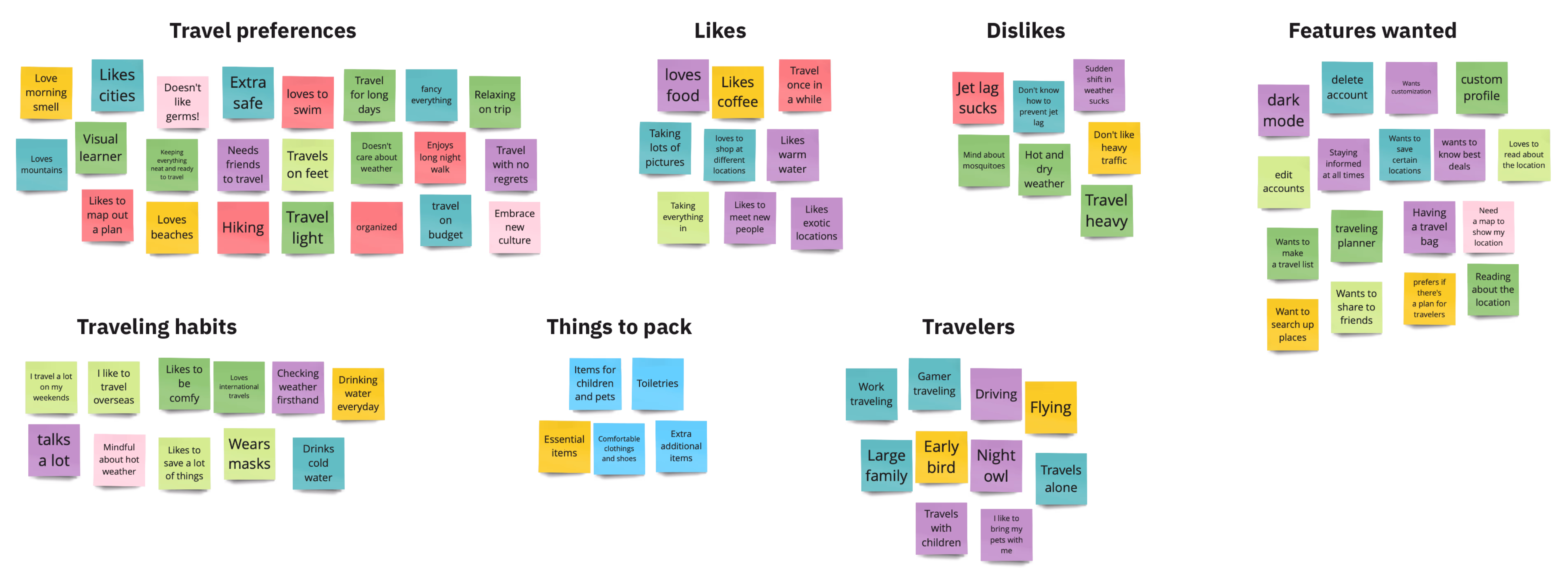
After conducting interviews and surveys, I organized over 60 qualitative data points into an affinity map to identify recurring themes and unmet needs. I organized interview and survey notes into virtual sticky notes, grouped them by behaviors, frustrations, and desires, then refined them into 4 core themes.
• Most users only addressed jet lag after symptoms appeared
• Travelers wanted personalized, proactive tips ahead of their trip
• Users preferred quick, actionable advice over complex health tracking
• Travelers valued solutions with visible scientific rationale
Say hello to our personas!
These personas served as a north star throughout the project. By grounding them in real user feedback, they helped us prioritize features and guided product decisions that solved actual user pain points.
Betty Hendal
“I can’t afford to be foggy-headed before a client meeting - I need quick, reliable ways to adjust.”
2–15 trips/year (mostly international)
Hydration tips, melatonin, avoids coffee after 3pm
• Stay sharp while traveling
• Minimize jet lag downtime
• Maintain personal routines
• Conflicting wellness advice
• Overwhelming travel apps
• No personalized tips
• Quick, tailored adjustments
• Calendar recommendations
• Simple guidance
Michael Tepilla
“When I travel, I just wing it - but man, that first night always wrecks me.”
5–7 trips/year (mix of international and local)
Sleeps on flights, drinks heavily, minimal prep
• Maximize adventure days
• Recover faster post-flight
• Stay flexible, spontaneous
• Forgetting prep routines
• Too structured apps
• Bad advice overload
• Easy, casual tips
• One-tap sleep tracker
• Quick hydration reminders
To narrow down feature scope for Acclim8s, I built an MVP matrix to rank potential features based on user value and implementation effort. This ensured we focused on what mattered most for travelers’ jet lag struggles.
Users cared most about easy, immediate actions they could control before and during travel. Data from surveys and journey mapping highlighted hydration, sleep, and pre-trip planning as top frustrations.
This MVP addressed 3 out of 4 core user pain points identified in research, allowing for fast delivery and focused testing. This helped reduce decision fatigue for users by providing quick, actionable plans customized to their flight schedule and destination.
• High value
• Medium effort
• Medium value
• Medium effort
• Insights: While tracking circadian misalignment sounded useful in theory, users weren’t interested in tracking their exhaustion, they wanted solutions, not status updates.
• Decision: High effort for low perceived value in MVP context. This was better suited for a later version once behavior change habits were established.
• Insight: Community support didn’t rank high during interviews/surveys. Most travelers preferred private, guided recommendations tailored to their trip.
• Decision: Valuable long-term for engagement, but not a critical need. Would require moderation, backend work, and content seeding too resource-heavy for MVP.
After mapping out all potential features against user research insights and effort-to-build estimates, I focused on addressing the most immediate, high-impact pain points travelers faced - things they could control before and during their trips to reduce jet lag.
The 4 prioritized features hit those marks:
• Directly tied to core frustrations users expressed (pre-trip planning, hydration, sleep management, arrival recovery)
• Quick to deliver tangible value without overcomplicating the app experience
• Feasible to prototype and test within MVP resources
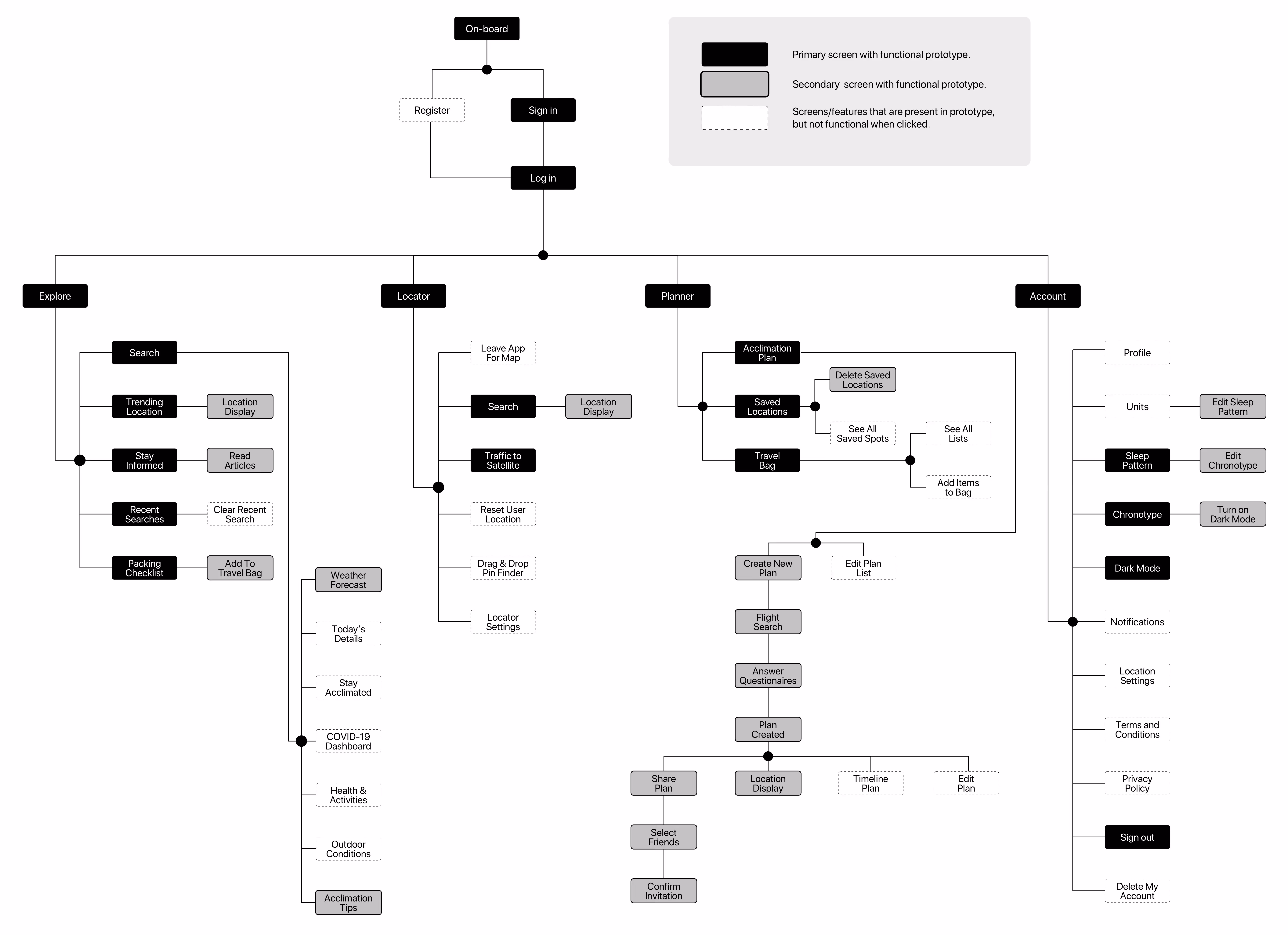
To define the app’s structure and navigation, I created an Information Architecture map based on user goals and prioritized features from my MVP matrix. This allowed me to design a product flow that guides users through jet lag management tasks in a clear, intuitive way.
• Challenges: Iterating on the IA revealed some friction points, especially when balancing simplicity with optional features. I refined the structure to keep primary actions within 2–3 taps and defer secondary tools to a side menu.
• Outcome: This architecture became the foundation for my wireframes and prototypes, ensuring a user-centric experience tailored to travelers' real needs and priorities.
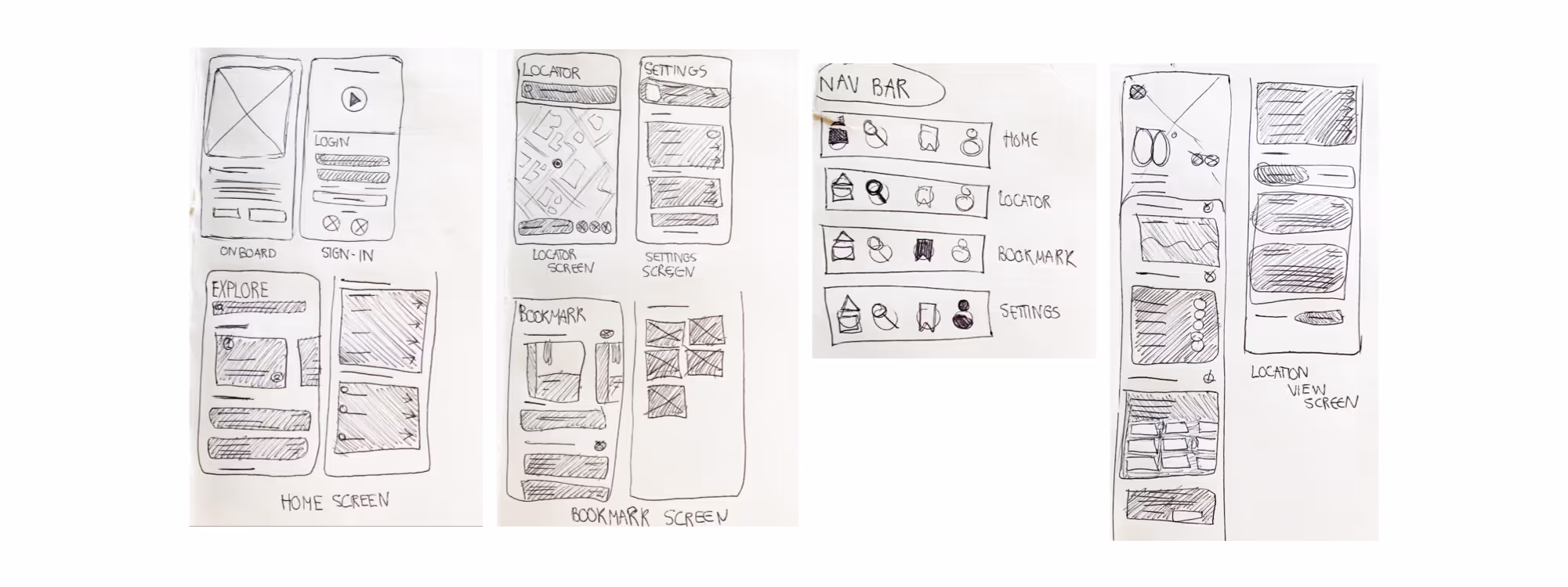
Before moving into detailed wireframes, I began by sketching out low-fidelity layouts to quickly test different ways users might interact with the app’s core features. This phase helped me stay focused on structure, task flow, and content hierarchy without getting caught up in visual details too early.
Sketching allowed me to quickly explore ideas, visualize how the Information Architecture would translate to real screens, and spot potential usability issues before investing more time.
I prioritized placing high-value features like Pre-Trip Plans and Reminders front and center while ensuring secondary tools were still easily accessible.
During this process, I iterated on multiple layouts for key screens like the Dashboard, Sleep Tracker, and Arrival Tips. I adjusted screen flows based on early feedback and identified areas where too many steps might disrupt the user journey.
• Outcome: This architecture became the foundation for my wireframes and prototypes, ensuring a user-centric experience tailored to travelers' real needs and priorities.
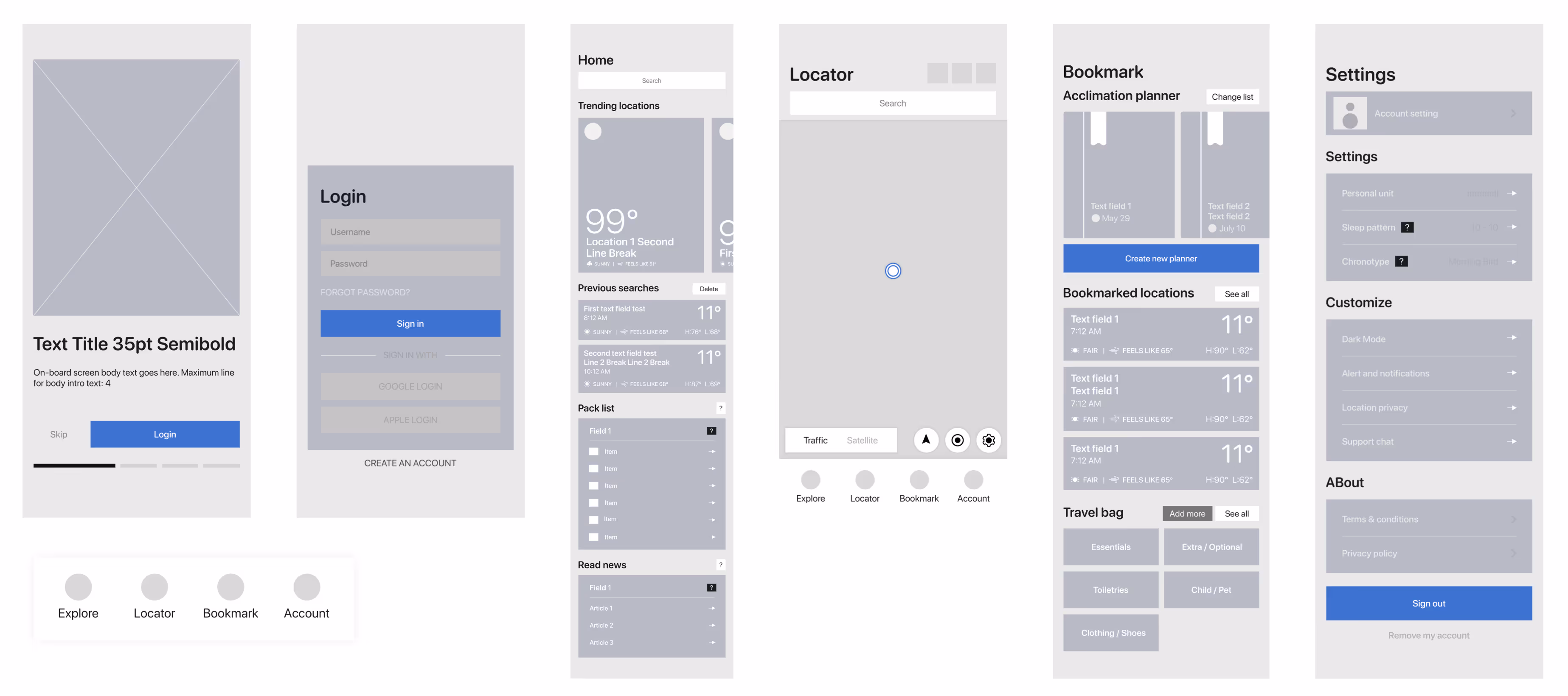
After refining my sketches, I translated them into low-fidelity digital wireframes. This step allowed me to define screen structures, navigation flows, and content placement while staying flexible for feedback and adjustments.
I created wireframes for core screens like Onboarding, Dashboard, Trip Planning, Map, and Bookmark, making sure key interactions were clear and actionable. This stage helped align the product experience with user expectations before moving into high-fidelity visuals.
My focus here was to validate the overall user journey, ensure screen-to-screen transitions felt intuitive, prioritize essential features identified in the MVP matrix, and spot layout issues or redundant steps early.
• Outcome: These sketches laid the groundwork for my mid-fidelity wireframes, ensuring the final app would align with both business goals and user needs before investing time in polished designs.
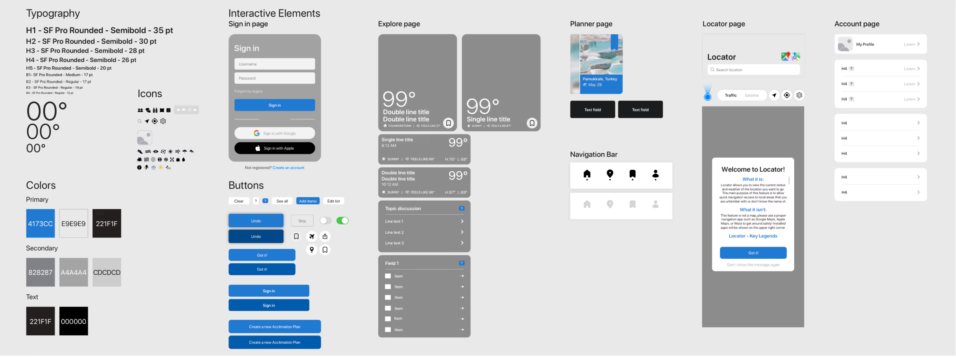
To maintain consistency across the app, I created a design system covering core elements like typography, color palettes, iconography, button states, and form inputs. This ensured visual harmony and made it easier to scale the product as new features were added.
The design system also improved collaboration with developers by providing clear guidelines for spacing, states, and reusable components - reducing guesswork and streamlining handoff.
Key components included:
• Typography styles for headers, body text, and labels
• Primary and secondary color palettes optimized for accessibility
• Interactive states for buttons, inputs, and navigation
• Icon set for key actions and navigation clarity
This system became the visual foundation for my high-fidelity screens, keeping the user experience consistent and cohesive.
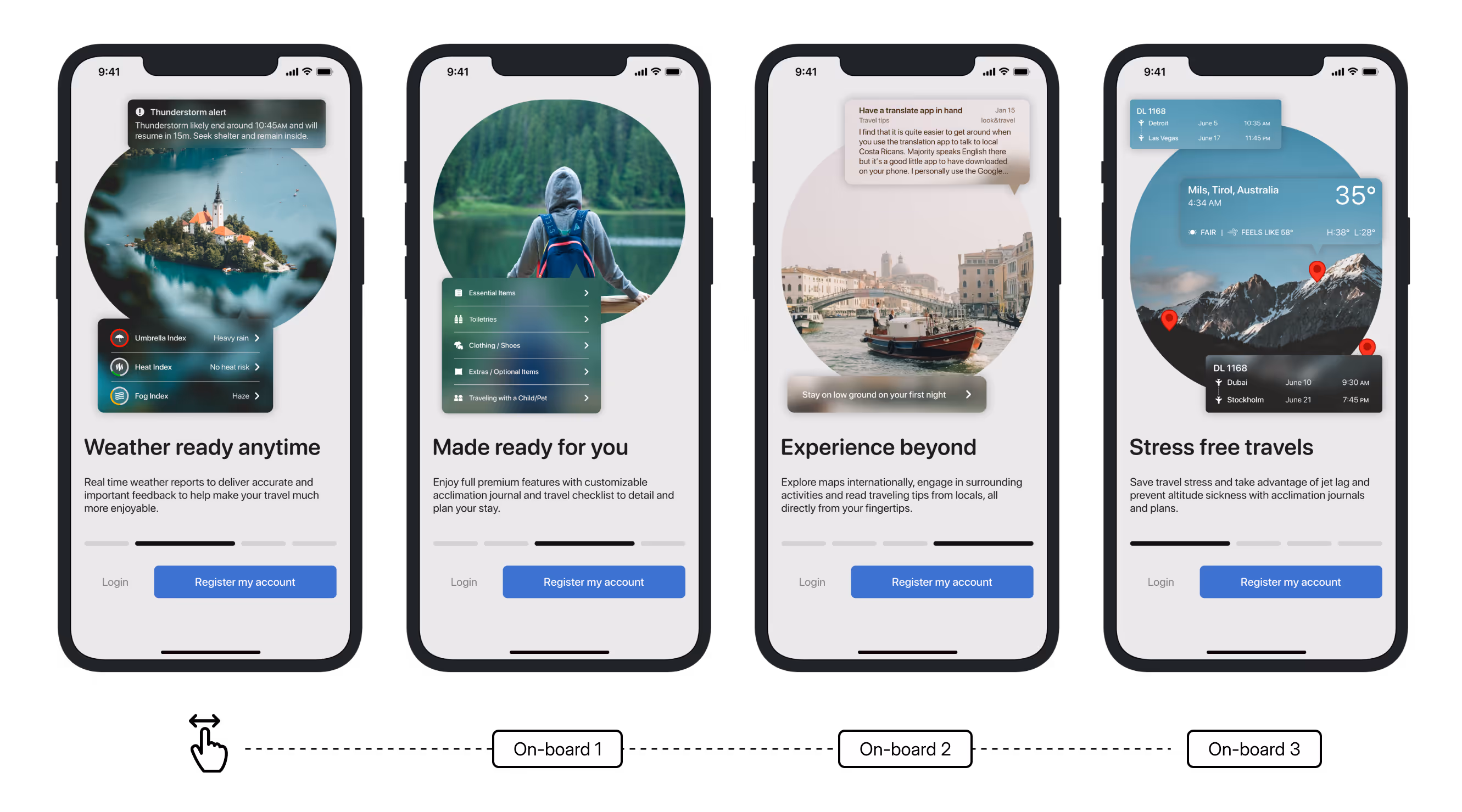
Building on the wireframes, low-fidelity and design system, I created high-fidelity screens to deliver a clean, accessible, and engaging visual experience. These screens incorporate the finalized color palette, typography, iconography, and interactive elements defined in the design system.
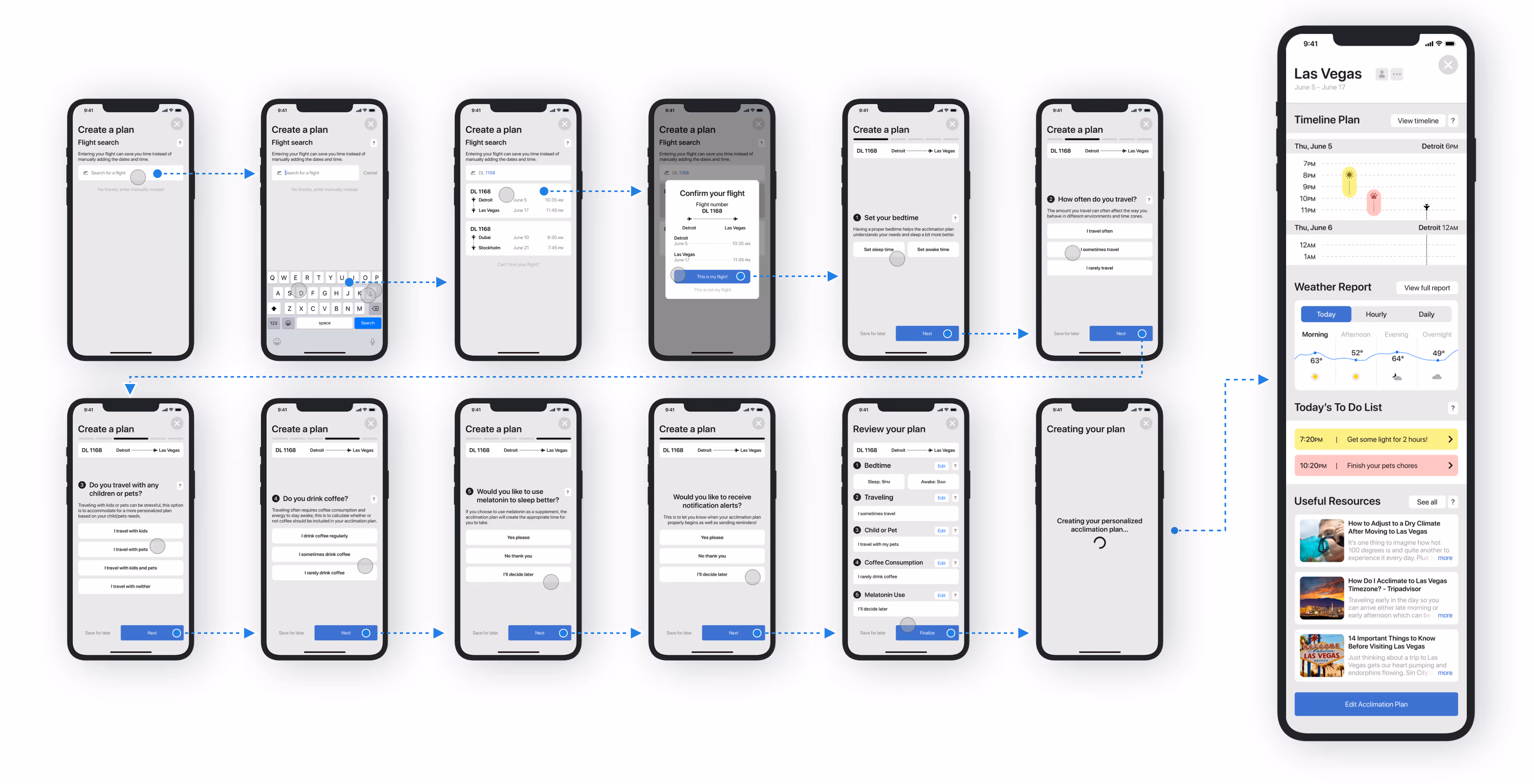
I designed a user-friendly onboarding process to introduce new users to the app’s core features and services, focusing on simplicity and efficiency. The flow emphasizes key features, like trip planning and safety services, and uses clear iconography and a reassuring tone to guide users.
The Home Screen serves as the main hub for users upon signing in. It features a search function, trending locations, articles on acclimation, and a travel checklist. These elements provide quick access to important content, offering users tools and inspiration for their travels.
Interactions are simple - clicking any of these sections leads to a deeper dive on separate screens, ensuring users can efficiently find information and plan their trips.
• A feed of trending locations based on popular searches from other users
• A section displaying the user’s recent search history for quick reference
• A list of articles and resources to help users stay informed about acclimation and travel tips
• A pre-made packing checklist that users can customize by adding their own travel essentials
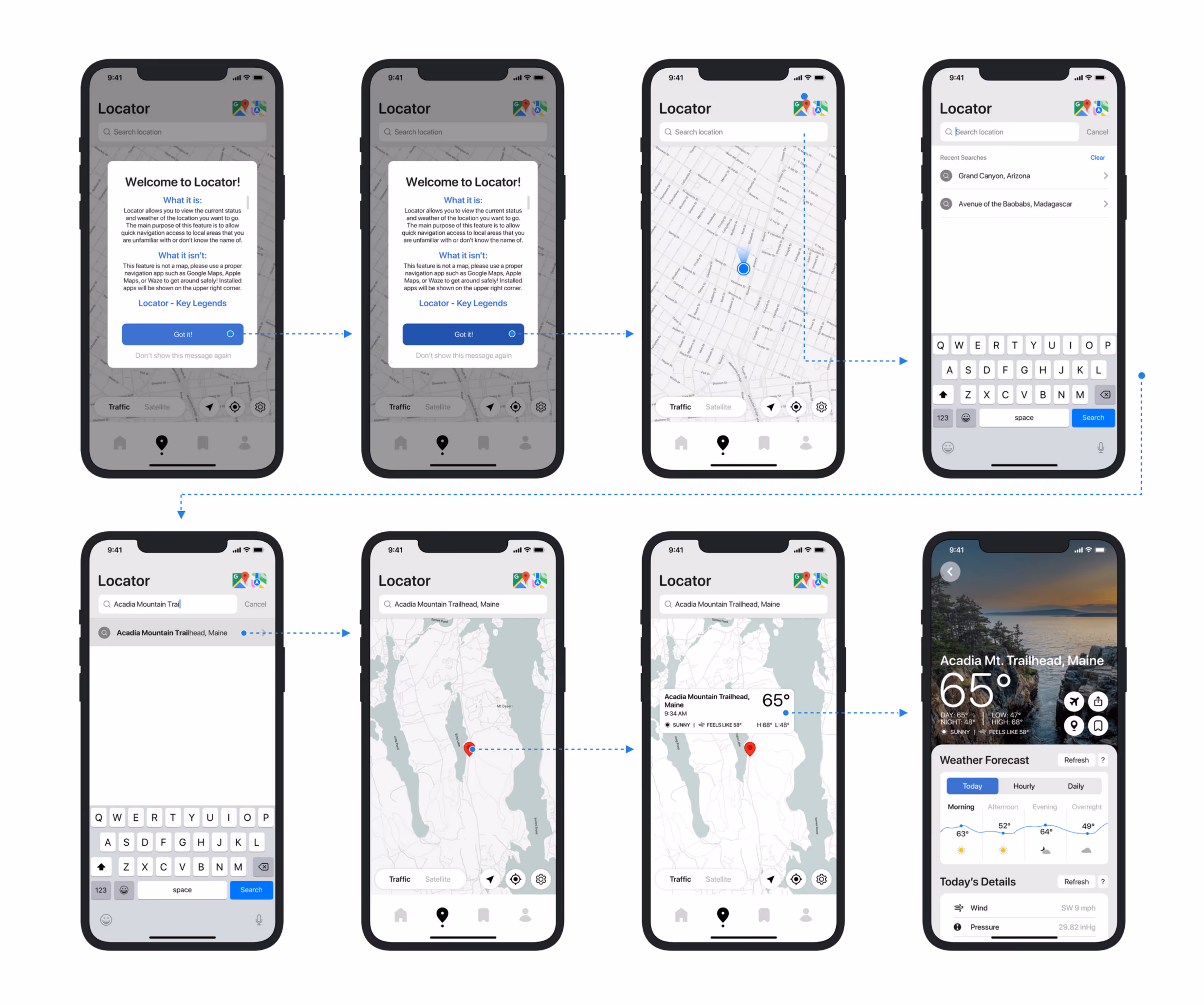
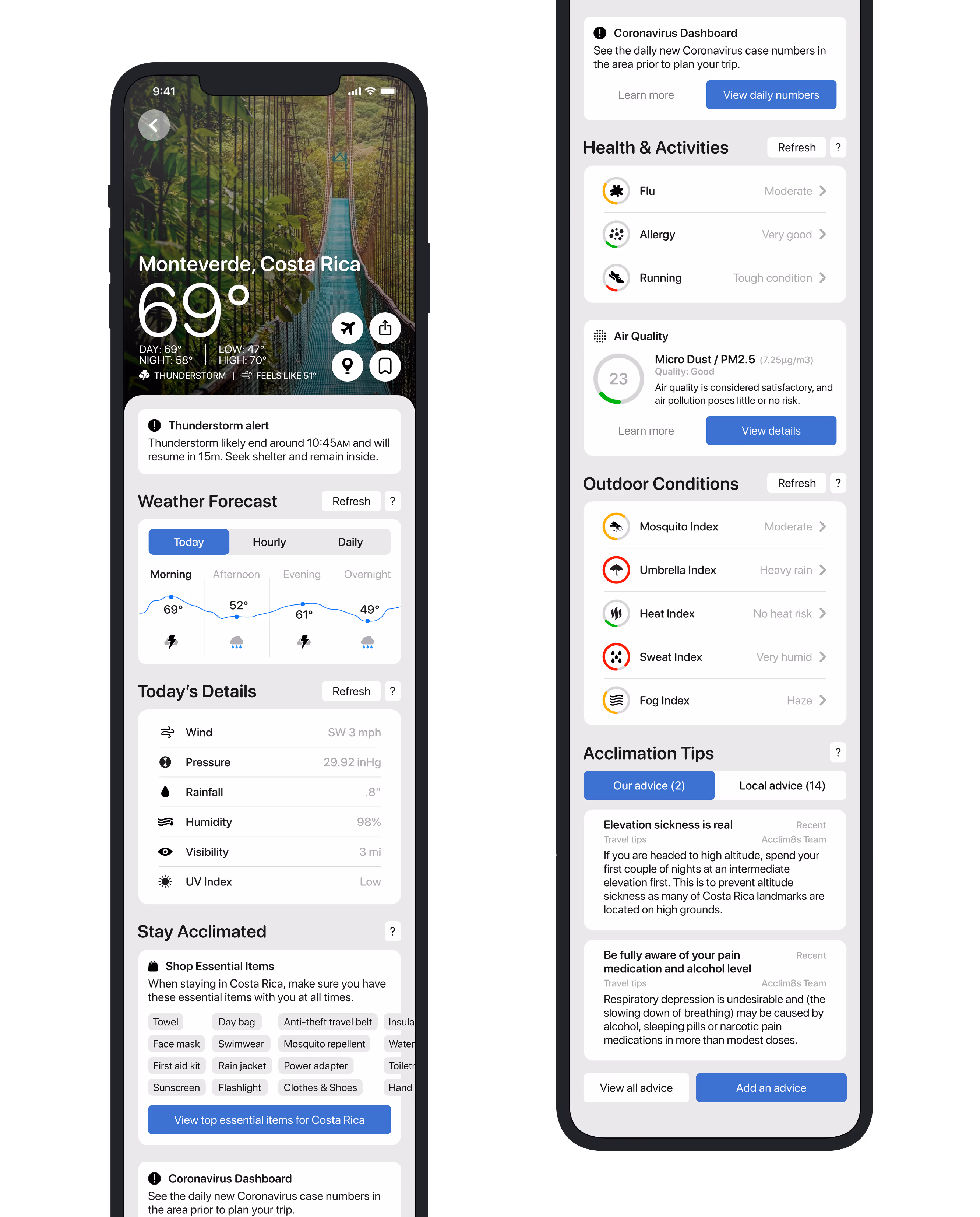
I designed the Locator Screen as a focused, lightweight alternative to a traditional map. Instead of overwhelming users with navigation tools, this feature lets them drag and drop a pin to instantly view local weather conditions and area names.
My goal was to give travelers a quick, reliable way to get situational awareness before heading out. By prioritizing essential details like climate and location context, I created a tool that improves decision-making without unnecessary clutter - keeping the experience clean, purposeful, and aligned with the app’s core mission.
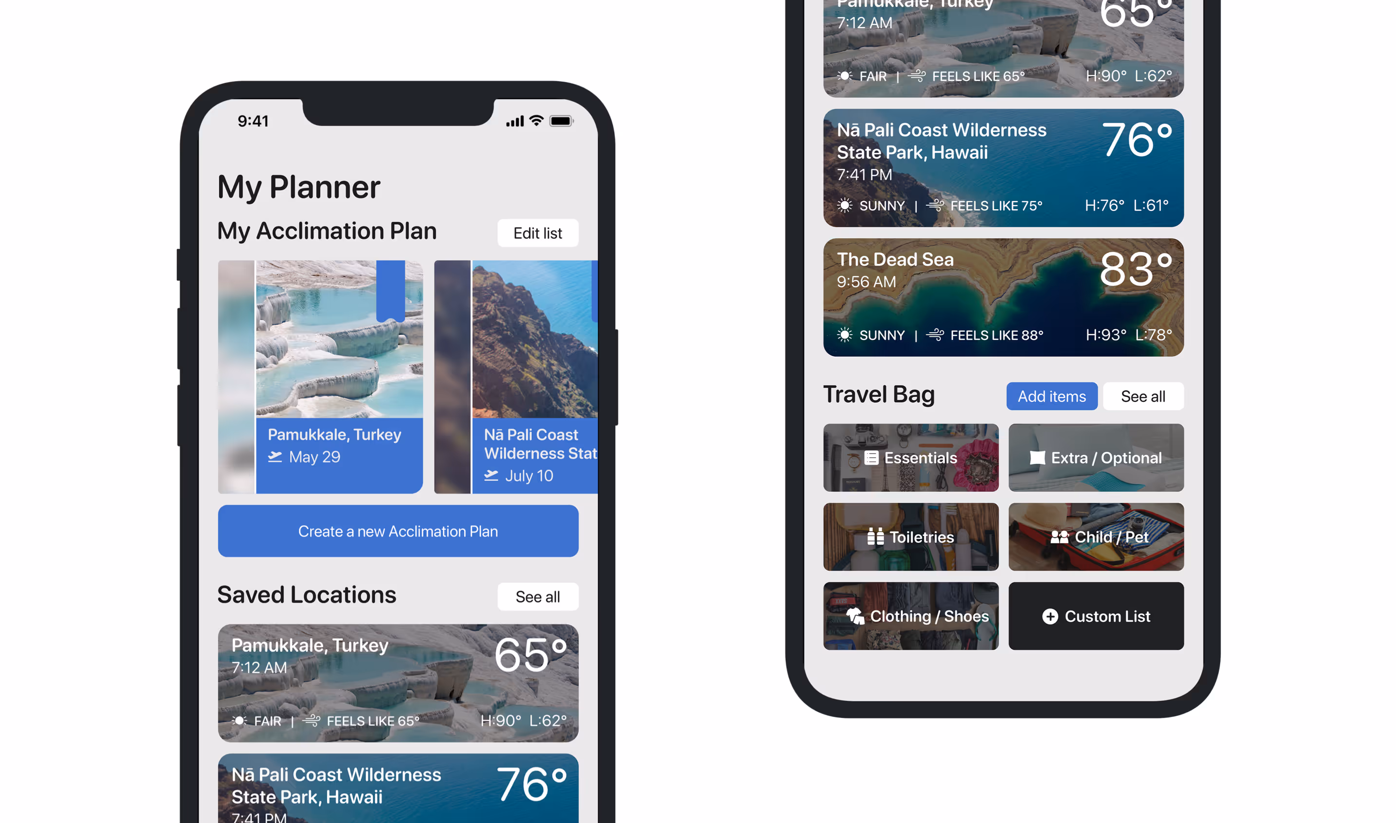
I designed the Planner Page to serve as a centralized hub where users can manage their travel experience in one place. This section allows users to create, edit, and share acclimation plans — personalized guides that help them adjust to new climates and sudden weather changes while traveling.
Alongside this, users can access their Saved Locations, a curated list of destinations they’ve marked for future reference. I also introduced the Travel Bag, a feature where users can save and organize essential items, articles, and travel resources they’ve gathered while exploring the app. This page was built to streamline preparation, giving travelers practical tools to stay organized, informed, and ready for any environment.
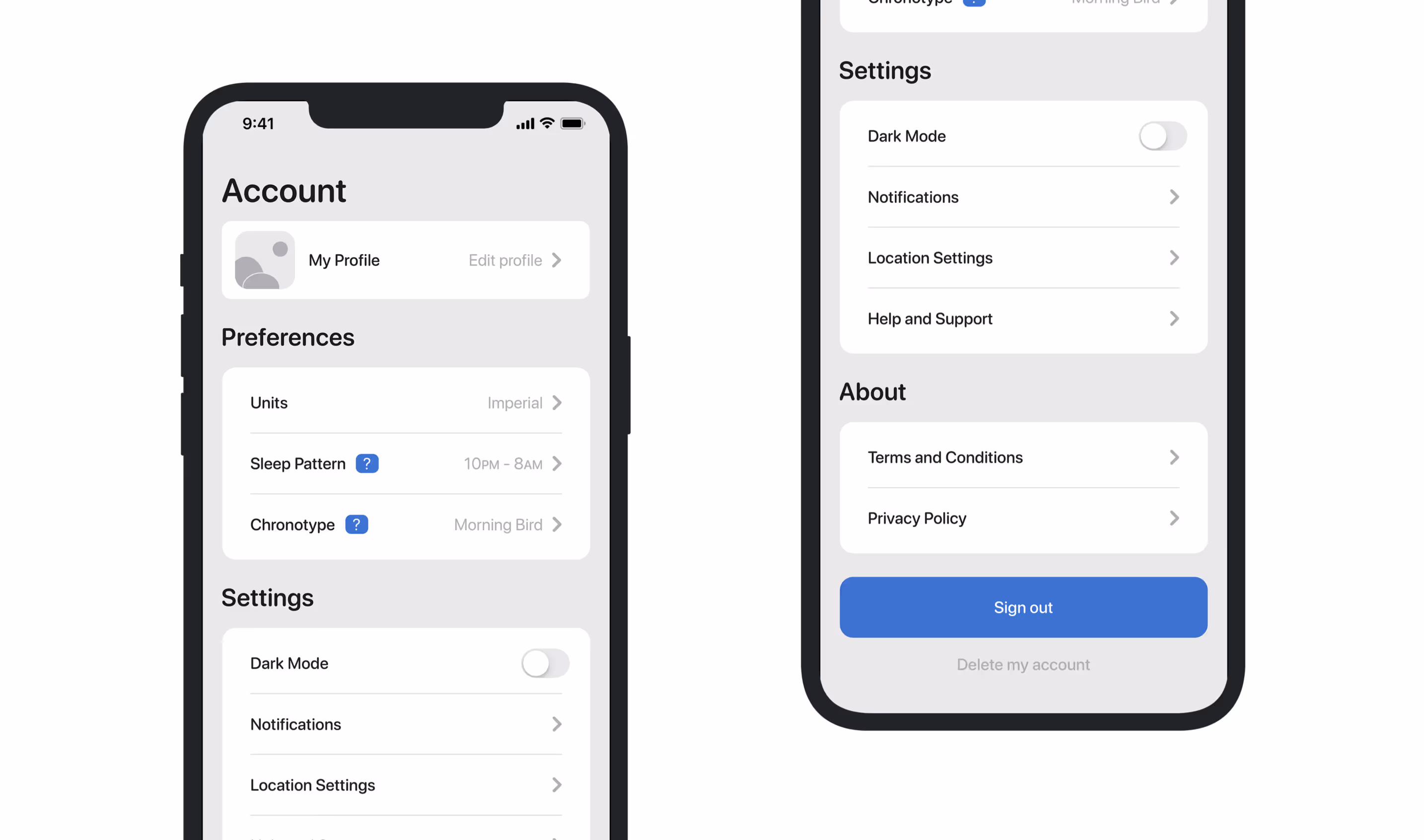
I designed the Account Screens to give users clear, intuitive control over their personal settings and preferences. Here, users can manage their account details, adjust privacy settings, and customize app preferences to suit their travel habits. I focused on creating a straightforward, user-friendly layout that simplifies navigation while keeping essential actions easily accessible.
The goal was to minimize friction, giving travelers quick access to their personal information and the ability to tailor their experience without unnecessary complexity. This section ensures users feel confident managing their app profile with ease.
I designed the Supporting Screens to enhance the overall user experience by addressing essential but often overlooked interactions within the app. These include screens for error messages, loading states, confirmations, and notifications.
My goal was to ensure that every part of the user journey felt intentional and consistent, even in moments of friction or pause. I approached these screens with a clean, approachable visual language and clear messaging, reducing user anxiety and maintaining trust throughout the experience.
By giving attention to these details, I helped create a product that feels complete, reliable, and thoughtfully crafted from start to finish.
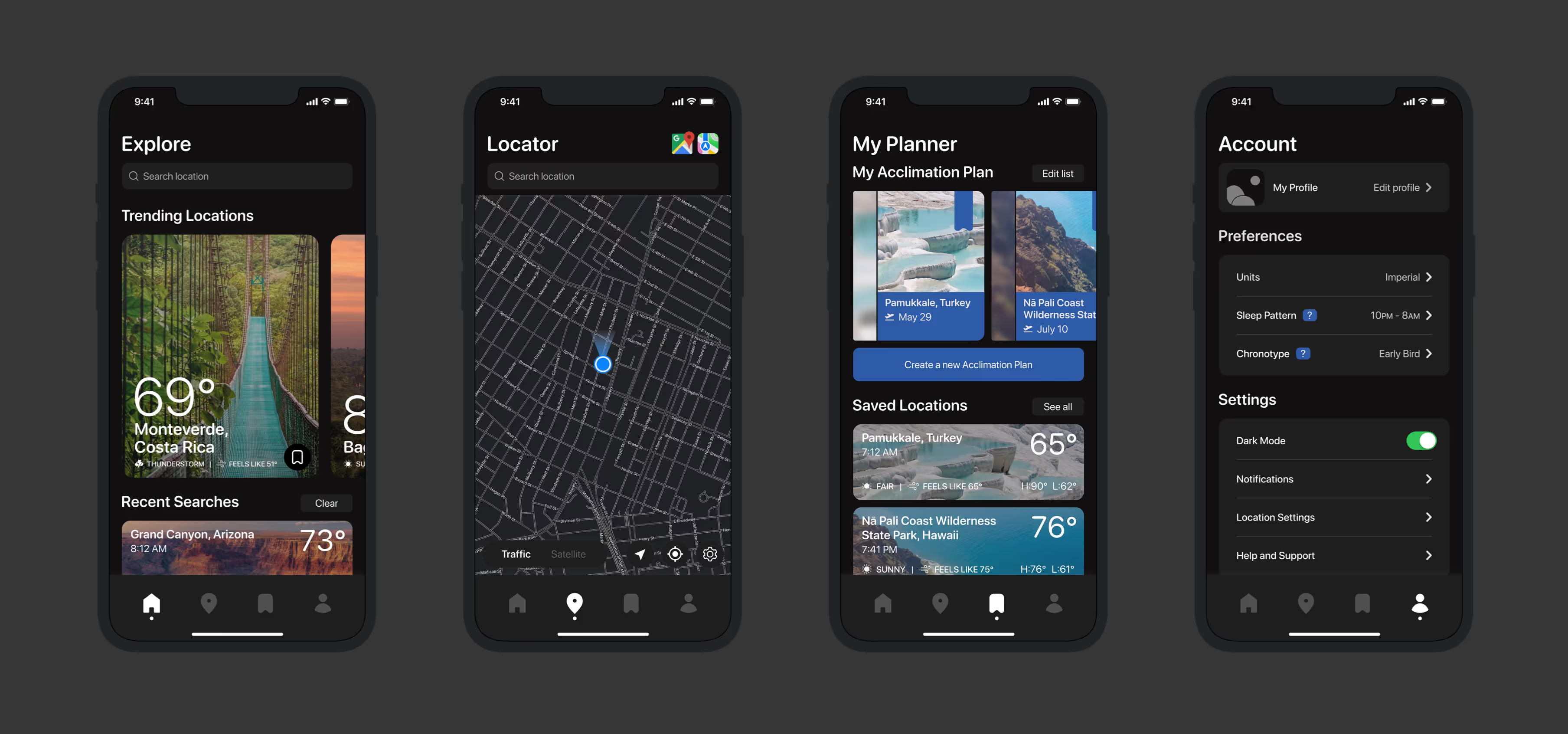
By incorporating a dark mode option, my goal is to improve accessibility and give users more control over their experience. This feature accommodates different lighting environments and visual preferences, allowing users to select the mode that best suits their needs.
On the Location screen, users can access detailed weather information, an essential travel packlist, a live COVID-19 dashboard, and an acclimation review system. This feature empowers users by offering first-hand acclimation tips from verified travelers and locals, ensuring they’re well-prepared for their destination.
On the Planner page, users can create a personalized Acclimation Plan by inputting their flight details (optional) and completing a brief questionnaire. Once set up, users can share their plan with friends, ensuring everyone is equipped for smooth acclimation to their new destination.
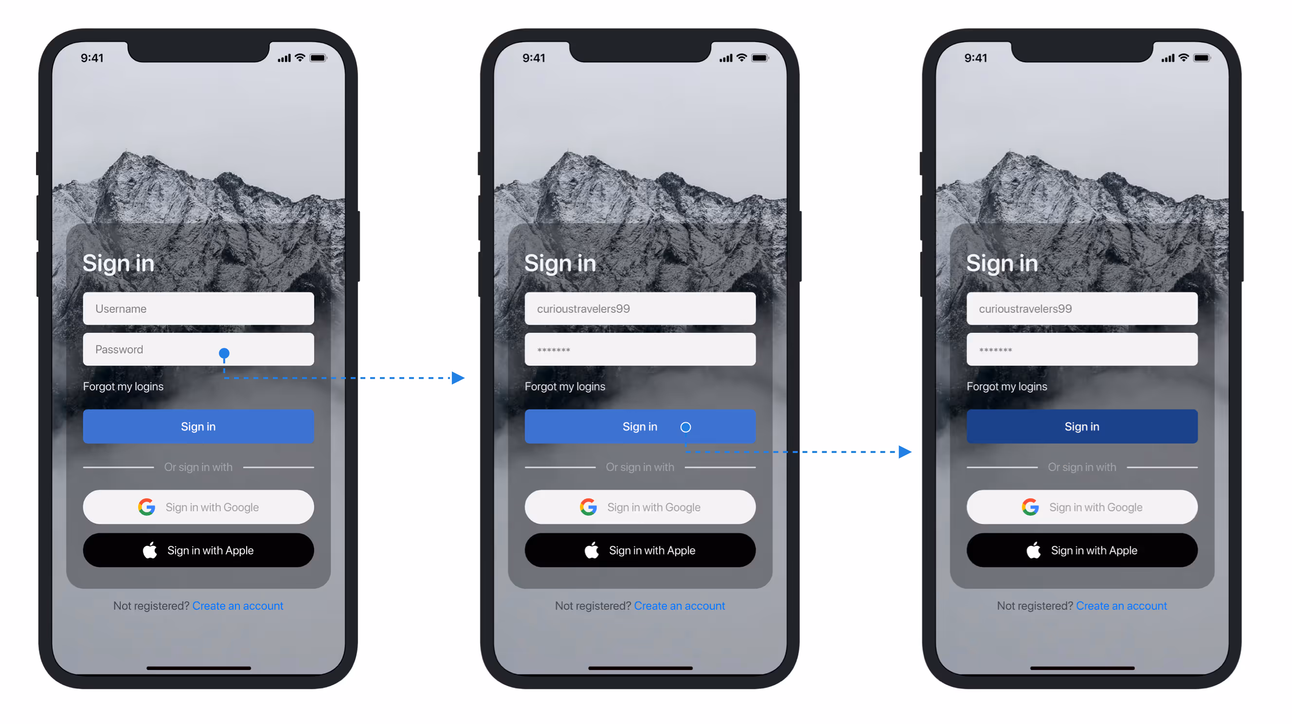
I designed interactive prototypes to bring the app’s core flows to life. This allowed me to simulate user interactions, test usability, and fine-tune the experience before development.
Prototyping helped identify pain points early and made it easier to iterate based on real user feedback. By testing key features in a dynamic, interactive way, I ensured a smoother transition from design to development, improving the overall user journey.
The app’s core navigation centers around four key pages:
•Home for personalized content and checklists
•Locator for real-time weather and area insights
•Bookmark to save itineraries and resources
•Settings for customizing notifications and dark mode.
Clean, intuitive, and travel-focused
Dark Mode enhances accessibility and gives users control over their viewing experience in different environments.
The Read an Article screen offers curated acclimation and travel content in a clean, scrollable layout.
The Adding Items to Travel Bag flow allows users to select and save items from the Explore or Location pages with a simple tap.
For Removing Bookmarks, users can easily swipe or tap to delete items from their saved list, keeping their bookmarks organized and relevant.
The Onboard Browsing process allows users to quickly navigate the app’s features after signing up, introducing them to key sections like the Home Screen and Locator.
I conducted a final round of usability testing with the same five participants from earlier sessions to evaluate the core functionality and overall intuitiveness of the app. Each participant was given task-based scenarios, and I timed their actions to gauge task completion efficiency.
• All participants successfully navigated the onboarding and login process and land on the home screen
• All users can located the packing checklist, activated Dark Mode, and removed a saved location
• Everyone was able to access the app pages and toggle satellite mode on the Locator screen
• Three out of five users intuitively found the share button within the acclimation plan page with ease
• Three users were initially unclear about the purpose of the Locator screen
• Two participants found the timeline feature in the acclimation plan confusing
• Two users recommended increasing contrast in location screens to improve legibility.
These insights reaffirmed the strengths of the app’s navigation and core features while highlighting specific areas for refinement. Moving forward, I plan to streamline the Locator screen’s onboarding cues, simplify the timeline interaction, and enhance contrast in key screens to improve overall accessibility.
During the design process of Acclim8s, I realized that travel is a deeply personal and context-sensitive experience, and the app needed to go beyond just functionality. I worked closely with users through feedback sessions to refine the app’s usability, making sure it addressed their needs of simplifying complex travel preparations.
The challenge wasn’t just in delivering intuitive UI elements; it was in creating a flow that guides the user seamlessly from planning to execution. Through multiple iterations, I learned the importance of balancing user expectations with innovative solutions, ensuring every decision put the user first.
What’s Next?
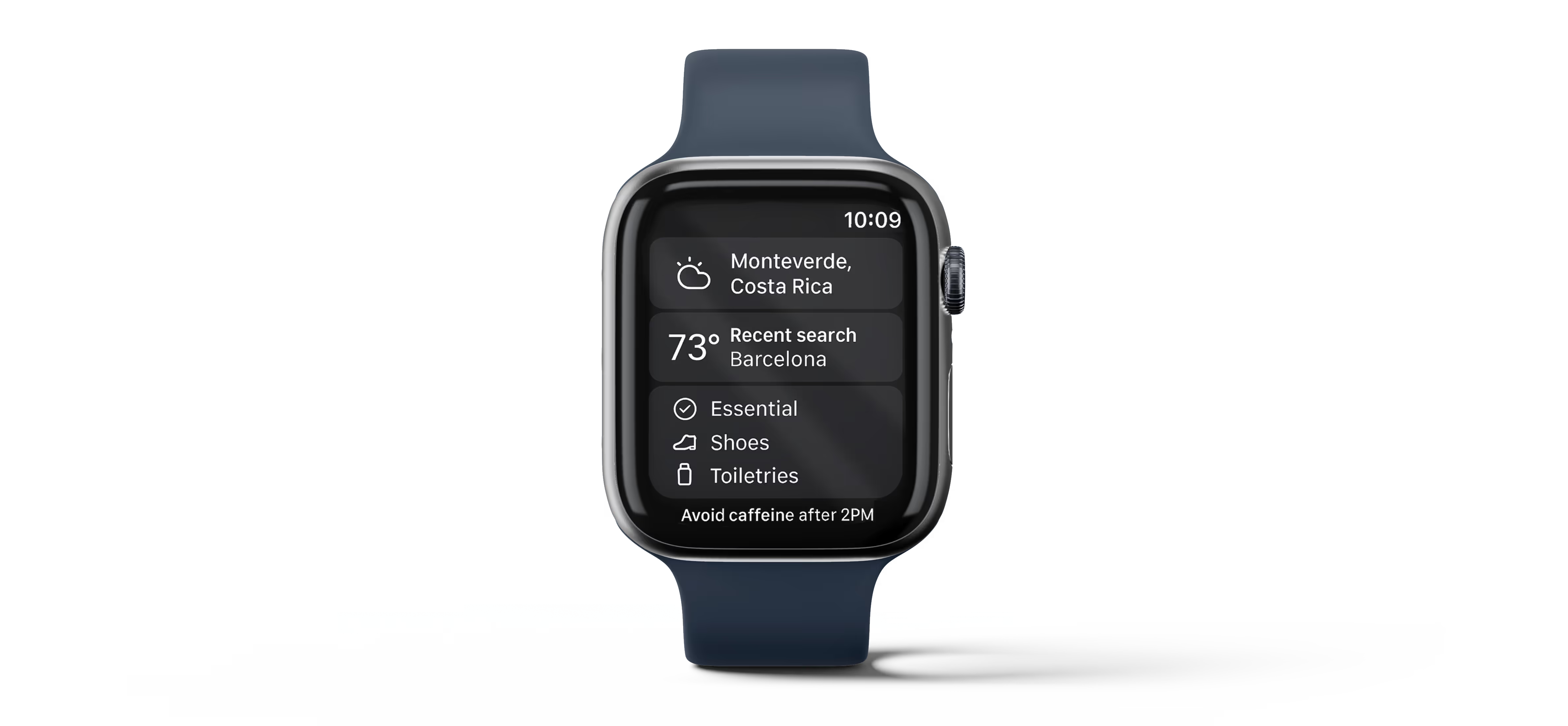
I plan to expand Acclim8s into a smartwatch version for more seamless travel management and quicker acclimation support on the go. I’m also considering a desktop experience to give users flexible access, especially for those who may not have immediate access to a mobile device.
What Was Tough?
The biggest challenge was iterating through deep stages of the app. Refining and rerouting prototypes to meet user expectations wasn’t always straightforward. Iteration consumed the most time - and I’m grateful it did. The constant back-and-forth with users uncovered insights that made the final product stronger.
Lessons Learned
This project taught me that sometimes, to truly design for others, you have to let go of personal preferences. Early in the process, I realized I was making decisions for myself, not my users. That shift in perspective - putting their needs ahead of my own ideas - became the most valuable takeaway. It reinforced the importance of user-first design through active listening and iteration.