Hello! My apologies! Currently, this website is only viewable on desktop. The desktop version contains my most recent work, but you’re more than welcome to check out my PDF Portfolio in the meantime. Thank you for understanding!
Learning X'P
ux/ui design
wip
Stellantis
ux/ui design lead
Porsche
ux/ui design lead
wip
Volkswagen and Audi
ux/ui design lead
wip
Acclim8s
ux/ui design
personal project
CreditCookies
ux/ui design
personal project
UKG Redesign
ux/ui design
personal project
Stellantis stands out because of its ability to bring seamless, user-centric solutions to a complex, high-stakes environment. The project transformed a chaotic design into a functional, intuitive system that serves two distinct groups: corporate users and dealers.

Through clear communication, adaptable design, and constant feedback loops, the project focused on improving usability, efficiency, and accessibility. With real-time insights, easy navigation, and smooth processes, the system now empowers users to make smarter decisions, track sales, and manage roles more effectively.

I am beyond excited to show you the behind the scenes of my proudest moments of working and designing this platform.
Timeline
Two years +
Role
UX/UI Designer
Deliverable
Desktop Platform
Tools
Adobe XD & Figma
Challenge
Being assigned as the lead UX/UI designer within just 4 months of joining a company, taking on a major project with a small but efficient team, where tight collaboration was critical and designs directly initiated development.
Goal
To ensure the success of the project through clear communication, close teamwork, and delivering designs that properly align with the feature briefs and development needs for Stellantis.
Within my first two months at the company, I was given the opportunity to step in as the lead UX/UI designer on a new project. It was an exciting challenge, especially being so new, but I quickly realized how crucial tight collaboration would be. Our team was small - just a project manager, frontend developer, backend developer, and a QA specialist - so our success depended on constant, clear communication that we put in.

Every feature brief I touched didn’t just stay on the design side; it directly kicked off the development process. I knew my role had to be precise and collaborative to keep the project on track and make sure every part of the workflow stayed in sync.
Over the course of this project, I’ve contributed to 12 core releases and 12 additional product expansions, playing a key role in refining workflows, enhancing security protocols, and optimizing dealership operations.

Each release progressively improved system usability, addressed dealership and corporate pain points, and aligned the platform closer to its long-term roadmap. Below is a timeline highlighting my contributions to these milestones.
Stacking Card Slider
Research
• Platform Analysis
• Platform Mapping
UX Audit
• Heuristic Evaluation
• User Flow Analysis
• Accessibility Review
• Content Audit
Design
• Wireframing
• Prototyping
• Information Architecture
• Microinteractions
Prototype
• High fidelity
• Interaction Prototype
• Usability test
• Usage Tracking
Testing
• Usability Testing
• A/B Testing
• Performance Testing
• Post-launch Feedback
Primary Goal
Lead end-to-end product design, driving user research, UX strategy, and UI execution to create scalable solutions that align with business goals, improve usability, and enhance user satisfaction. Collaborate with stakeholders and engineering teams to navigate ambiguity and deliver impactful product iterations.
Secondary Goal
Bridge the gap between current interfaces and high-fidelity designs, while translating web features into a mobile-first experience. Focus on boosting dealership productivity and streamlining workflows.
I inherited a design file that was barely usable - unfinished prototypes, no guidelines, and a disjointed UI. It was clear the team was stuck in a loop of rework and delays.

I took the time to break everything down: I audited every screen, identified gaps, clarified flows with the devs, and rebuilt a consistent design system from scratch. It wasn’t just about fixing visuals, I wanted to create a clear source of truth that made everyone's job easier and smoother.

Here's what I’ve gathered from my deep analysis:
Incomplete Design File
• The design was unfinished with various of unfinished prototype links, making it difficult to work with and causing delays in development.
Inconsistent User Interface
• The design lacked uniformity, leading to a disjointed experience for users and making it harder for developers to implement a cohesive interface.
Poor Design & Development
• The actual site and the design file did not align, making QA testing difficult and leading to inconsistencies in the final product.
Poor UX Leading to Pain Points
• Users faced unnecessary difficulties due to unclear interactions, making it hard for them to complete tasks efficiently.
No Design Guidelines
• Developers had no clear reference, leading to misinterpretations, inconsistencies, and additional back-and-forth between design and development.
Project Delays + Increased Workload
• Designer and developers spent extra time fixing issues instead of progressing smoothly, slowing down the project timeline.
As the lead UX/UI Designer, I took full ownership of revamping the project, rebuilding the system from scratch for seamless usability. Not only was this crucial, but it pays dividends in the two years I was on the project.

By mapping key details across both mobile and web platforms, I prototyped and tested solutions for key screens before finalizing the high-fidelity designs.

What started as a chaotic system is now a clean, intuitive, user-friendly design for both corporate users and dealerships. You're welcome to switch between the Pages and the Prototypes to compare the difference.
The Pages
The Prototypes
This platform is built around two distinct user journeys: the Field Side, used by Stellantis corporate teams to monitor dealership performance, and the Dealer Side, where on-the-ground staff record sales to qualify for incentives. While the user flows and priorities differ between the two, both are connected to a single backend system that ensures data consistency, real-time syncing, and transparent reporting.
Corporate User (CMS)
User Management & Access Control
Data-Driven Decision Making
Progress Reporting
Performance Analytics
Target Monitoring
Sales Tracking
Real-Time Insights
Dealership Comparison
On the Field Side, I focused on creating a dashboard experience that gave corporate users the ability to track KPIs, drill down into individual dealerships, and monitor incentive program participation with ease. The redesign emphasized clarity, speed, and modular views that update dynamically as campaigns progress
Dealership User (Engagements)
Performance Tracking
Sales Logging
Incentive Tracking
Data Visibility & Transparency
Accurate Reporting
Real-Time Insights
Automatic Backend Integration
Dearlership Accountability Program
On the Dealer Side, I worked closely with our frontend and backend devs to create an intuitive, feedback-driven interface where sales reps could log their activity without friction, receive instant validation, and track their progress toward goals. This helped increase accuracy while reducing the cognitive load for busy dealership staff.
Building on the wireframes, low-fidelity and design system, I created high-fidelity screens to deliver a clean, accessible, and engaging visual experience. These screens incorporate the finalized color palette, typography, iconography, and interactive elements defined in the design system.
I created a comprehensive Design System for frontend developers, ensuring consistent standards for future QA work.

I completely rebuilt the design system from the ground up after inheriting a scattered and outdated file. My goal was to create a structured, scalable system that our frontend developers could rely on for consistent Design QA.

It became a core part of how I worked - speeding up design tasks, keeping everything aligned, and making cross-team collaboration smoother. As the project evolved and client needs shifted, I continuously refined the system, treating it as a living resource that grows with every iteration. This system now underpins all of Stellantis’ UI across both Dealer and Field sides.
This section walks through the key user flows for both Field and Dealer users. Throughout different feature releases, I’ve been closely involved in ideating, researching, designing, and testing multiple iterations to ensure each experience feels intuitive and aligned with user needs.

These flows were shaped by real user feedback, client input, and hands-on collaboration with devs. From early sketches to final prototypes, each step went through careful review before being approved and launched. The examples below highlight some of the most impactful features, refined through multiple rounds of validation and iteration.
Login Process

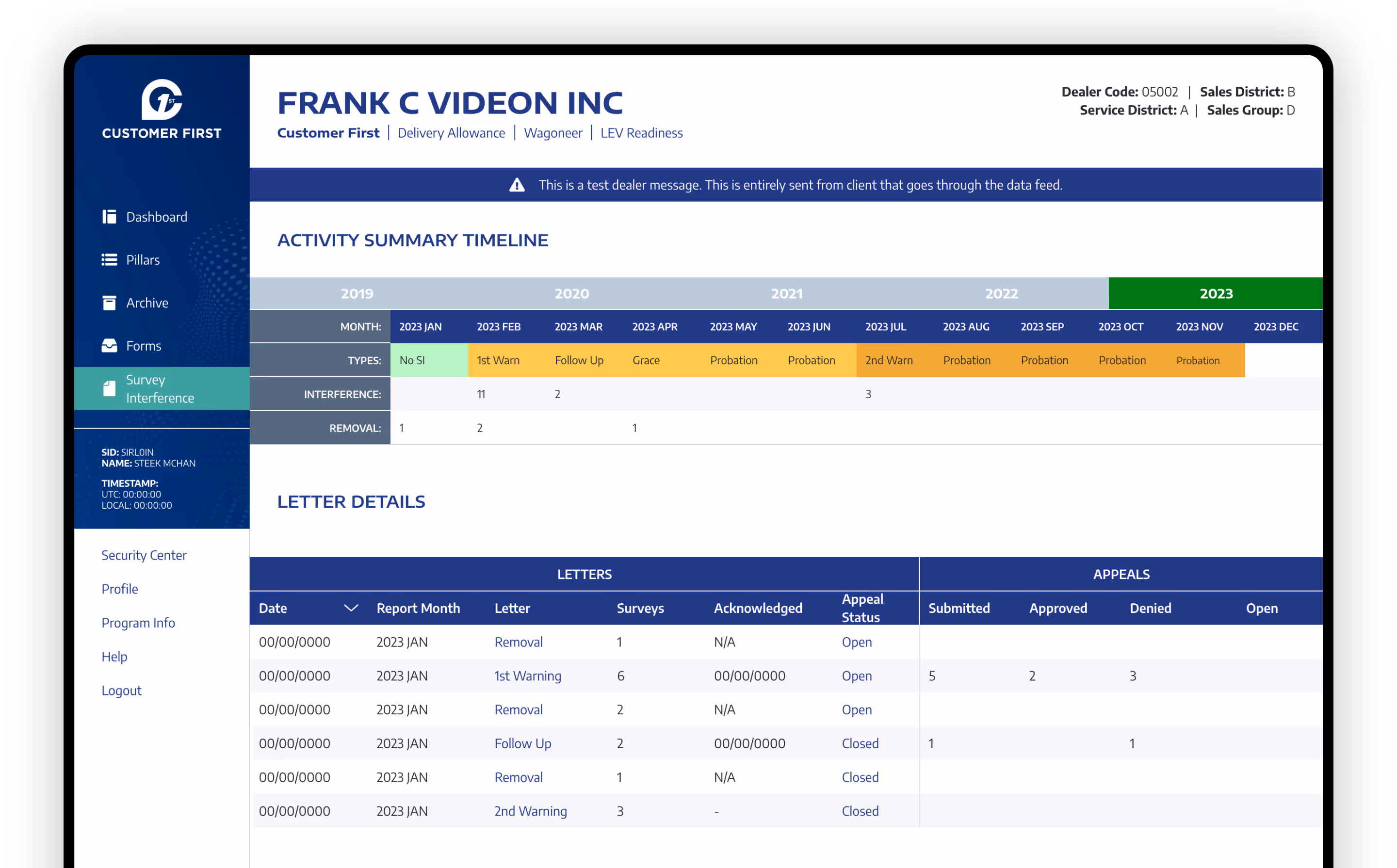
When I first approached the onboarding and navigation experience, my goal was to make it as smooth and intuitive as possible. I knew this flow would set the tone for how corporate users interacted with the system daily. I revamped our login page where field users start by selecting their entity, UID, domain, and role, then land directly in the program dashboard, already populated with relevant data tailored to their access.

Program Switch

One of the pain points I noticed early on was how clunky it was for users to jump between different dealerships or domains. That led to me designing a program switcher that keeps users oriented and in control, no matter where they are in the platform. No reloads, no context loss and the goal was to focus on fast switching.

Control Center

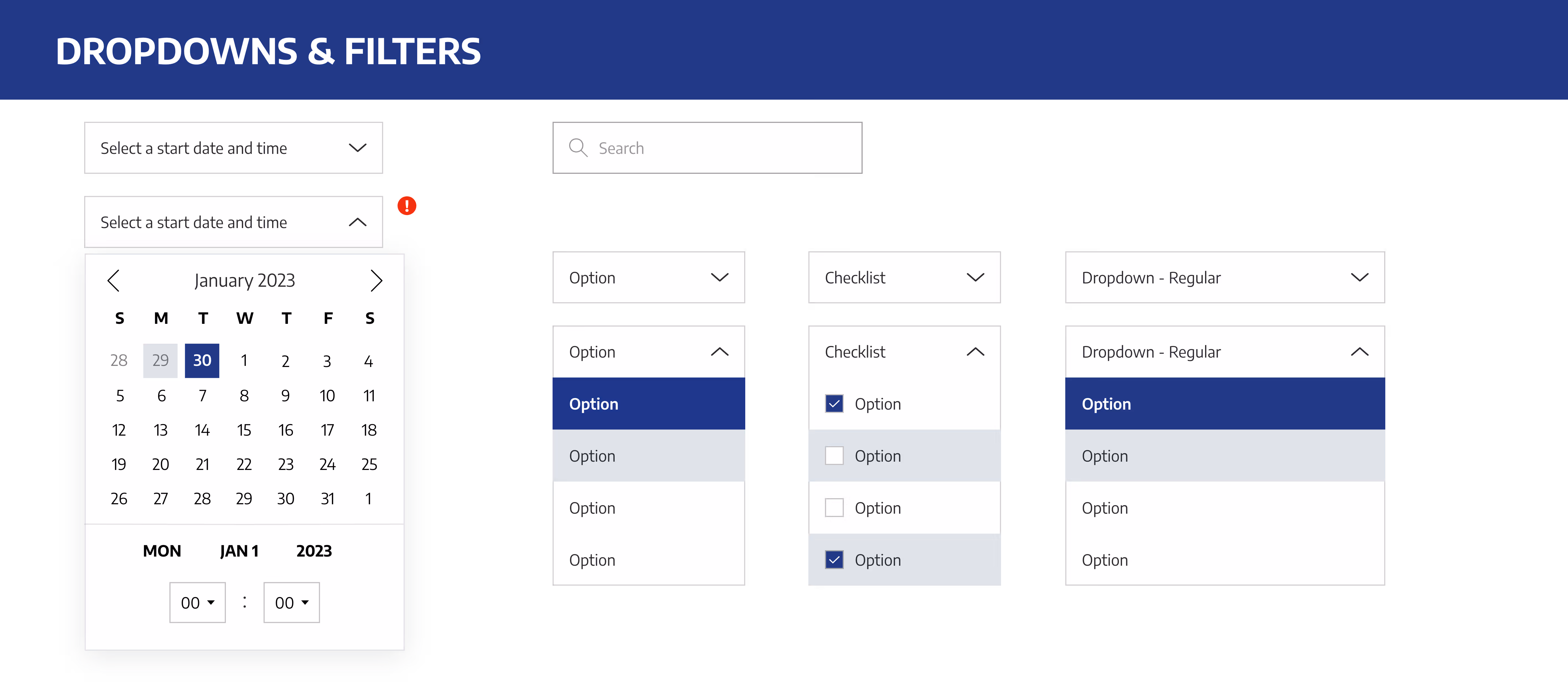
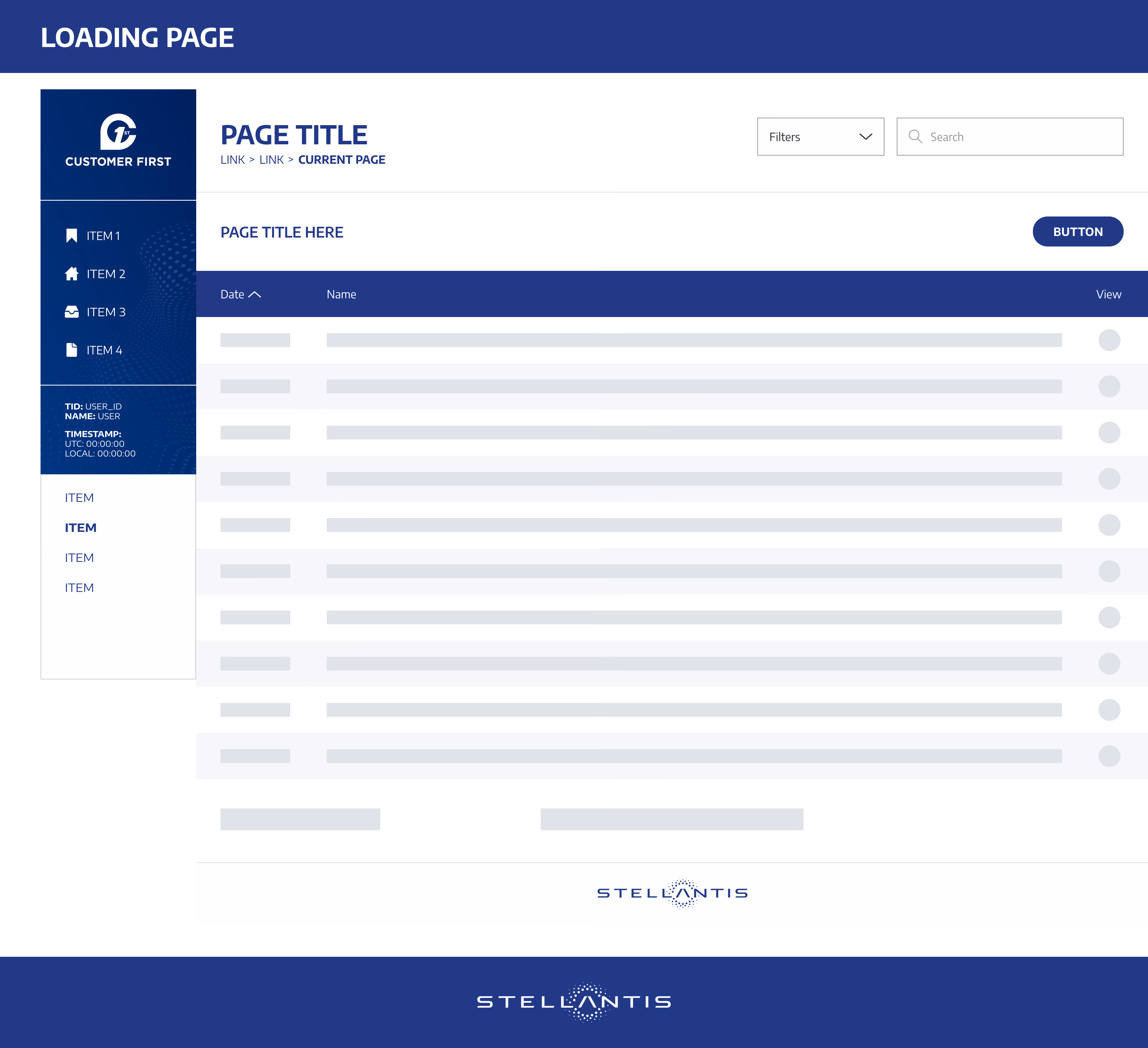
The side navigation got a full redesign as part of a more recent update I led. The new structure supports both Field and Dealer users, giving them freedom to navigate across programs, domains, and tools without interruption. This update introduced a consistent visual language, collapsible sections, and clear iconography, improving usability for both new and veteran users.

Results

By allowing users to move through the system without breaking their workflow, we dramatically reduced confusion and increased task completion speed. This navigation update both made the system smoother and laid the groundwork for future scalability and accessibility as the system continues to grow.

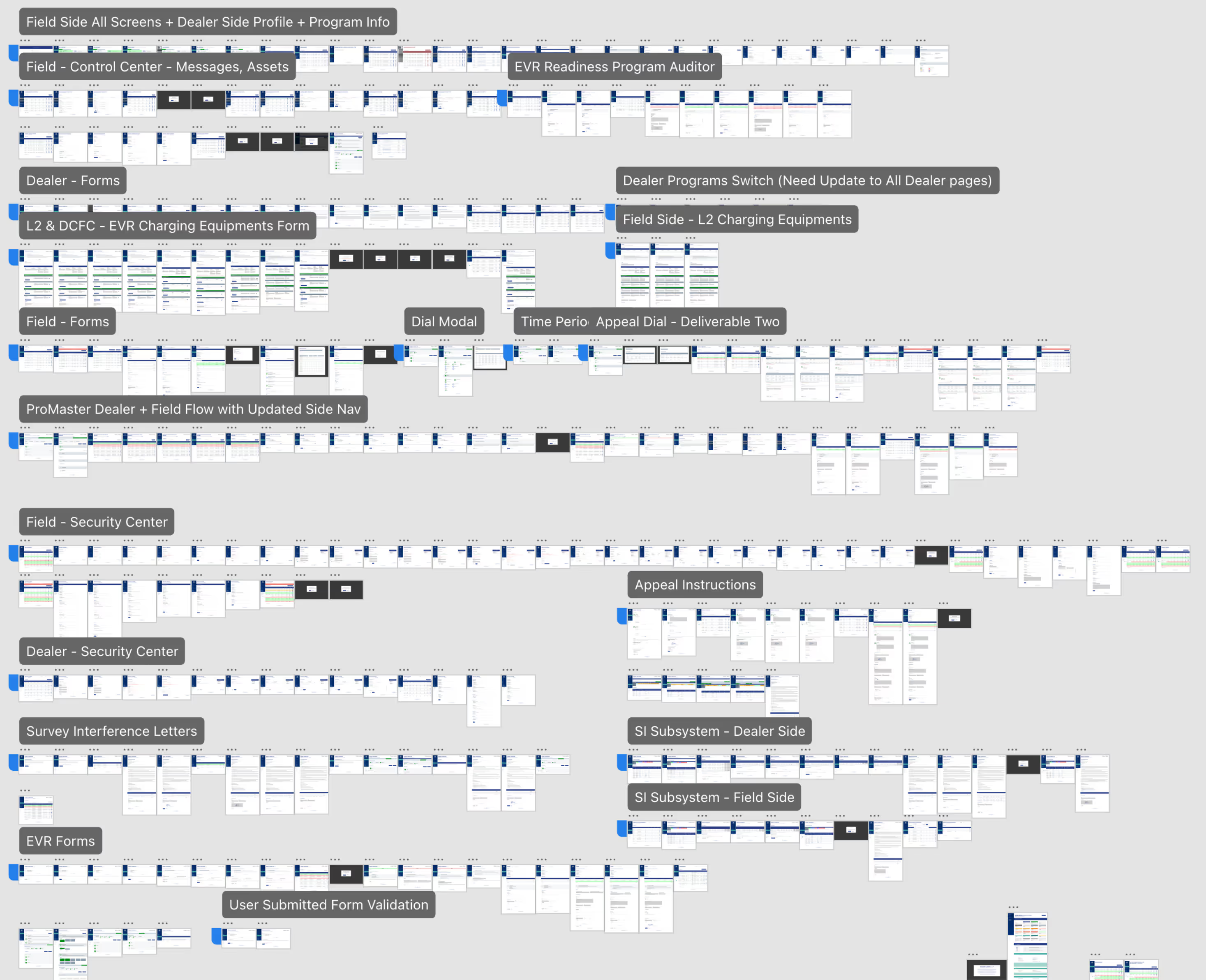
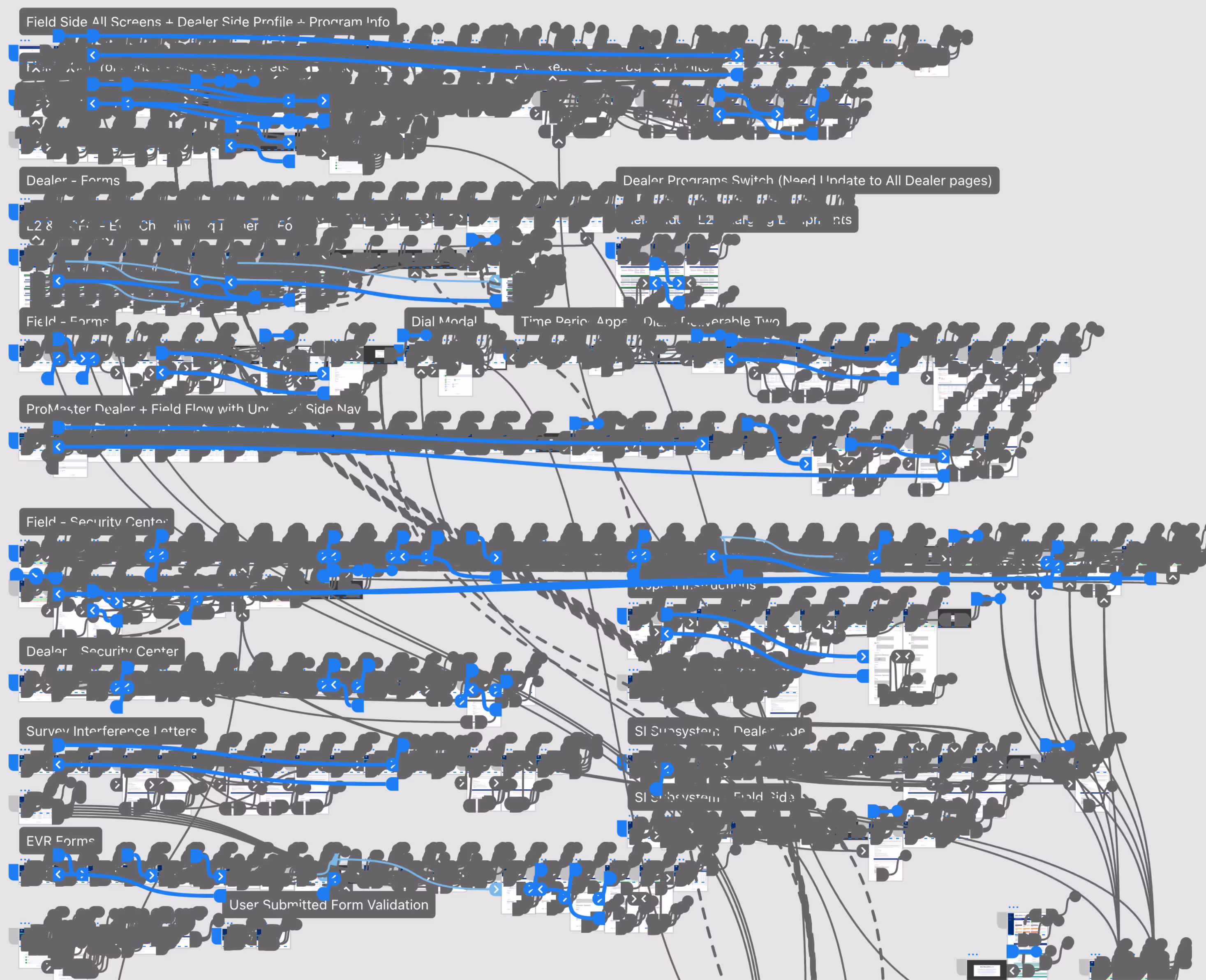
Below is a visual breakdown of how I restructured the Field Navigation Flow, showcasing the improvements in layout, logic, and ease of use.
For the L2 & Charging Equipment flow, I focused on improving visibility and access for our Field users. When a dealership submits a form to borrow equipment, field users can review and take action on that request. I also made sure they could revisit the request view page even after submitting their decision, adding flexibility for follow-ups, tracking, or record-keeping.

This improved the overall transparency of equipment loans and made it easier for field users to manage them at every stage.
L2 Forms Interaction - Adding and Deleting an Equipment
I designed the flow where dealer users can easily add or remove charging equipment. The interaction is smooth: when a user adds a secondary row, the delete icon appears, enabling them to delete equipment as needed. This allows for a clean and intuitive process to manage equipment without much of the confusion.
The Dealer Appeal Dial is a key feature I designed to enhance the flexibility and transparency of the appeal process for dealers. This feature was introduced to combat previous misalignments between dealer and field users, reducing the friction caused by miscommunication. By streamlining the appeal process, I allowed dealer users to directly challenge decisions they believed were incorrect, providing greater control and oversight.

I simplified the flow, allowing dealers to submit appeals easily, and created a clear pathway for field users to review and decide on these submissions. This ensures faster resolution and better alignment between both sides, improving user experience and reducing unnecessary delays.

Key Improvements:

• Simplified interface
: Reduced unnecessary steps and visual clutter, enabling users to quickly submit and manage appeals.

Increased transparency: Dealers are now empowered with a clear view of their submitted appeals and the status of each one.

Cross-side collaboration: This feature streamlined communication between dealers and field users, preventing misunderstandings and providing more timely decisions.

The Dealer Appeal Dial has become an essential tool, ensuring that the appeal process is not only smoother for dealers but also more manageable and efficient for field users. Through these enhancements, I contributed to improving the system's overall efficiency and user satisfaction, ensuring that the system better met the needs of both dealer and corporate users.
The Dealer Data Modal is a powerful tool designed for the Dealer side to centralize live program data, including sales, incentives, current program participation, and historical records. I transformed this feature as part of my Stellantis redesign, turning a once static, complex interface into a highly interactive and dynamic experience.

Dealers can now easily scan, filter, and manage program records with intuitive navigation, making it effortless to track and make data-driven decisions. By pulling real-time, client-specific feeds, the modal adapts seamlessly to each dealer’s needs all while ensuring flexibility without sacrificing clarity.
When I first tackled the Incentive Monitoring System (IMS), I focused on making both the Dealer and Field flows clear and efficient. This setup helped the corporate team quickly process appeals and track dealership compliance in a structured, efficient way.
Field Side

Designed a user flow that allowed corporate users to monitor dealership violations and manage warning or probation statuses.
• Integrated filtering capabilities and dashboard tools including Acknowledgements, Surveys, Appeal Status, and time-based reporting.
• Streamlined appeal review processes to improve efficiency and clarity across compliance tasks.
Dealer Side

Built a clean, intuitive interface for dealers to view violations, access corporate letters, and submit appeals.
• Prioritized ease-of-use by simplifying navigation and content layout to reduce friction during the appeal process.
• Ensured dealers could take action quickly without needing technical support or extra guidance.
Field Side: Submitting a Requests

Security Center manages access control across the platform - handling role assignment and removal for both corporate and dealer users. When I first joined, the submission flow was incredibly difficult to complete. Most users couldn’t get through it without support. I reworked the entire request process from the ground up, simplifying how field users submit role changes and security access requests to peersy breaking it down into four clear, digestible steps:

• Selecting the role type
• Entering the SID/TID
• Choosing an action
• Providing the reason and priority level

This streamlined approach made submissions faster, more intuitive, and far less error-prone. This feature empowers secure collaboration across domains and enhances transparency in role management.

The overhaul took nearly eight months, involving deep iteration, testing, and heavy feedback loops.
Field Side: Reviewing Access Requests

Once a request is submitted, a designated corporate approver receives it for review. From there, they can approve or deny the access request, triggering an automated response back to the original sender. This flow was designed to ensure clarity, reduce turnaround time, and maintain a clean audit trail for security-related changes. I focused on tightening visibility and ensuring that no request could fall through the cracks.
Field Side: Viewing a Form

Even after the initial field decision, field users can still view accepted or denied requests. This takes them to the request's view page, offering increased flexibility for tracking purposes and logging.
Dealer Side: Submitting a Request

Dealer users can also submit Security Center requests to update or change their roles within the system. While this mirrors the field side in structures, it operates with more restrictions. Dealers have limited administrative permissions, meaning their requests require higher-level field approval before any role changes can take effect.

I designed this flow to maintain consistency with the field experience, while still enforcing role-based access boundaries. The goal was to keep the process user-friendly for dealers, but secure enough to align with corporate oversight requirements.
Field Violation Submission Workflow

Field users are responsible for initiating and managing the violation form process. I redesigned this flow to give corporate users the ability to create, preview, and publish violation or infraction letters directly from the system. Once submitted, these forms are automatically sent to the appropriate dealer account. Field users can also track the status of submitted forms, make edits if needed, or revoke them before dealer action. The improved interface made it easier to locate dealerships, filter by region or violation type, and manage multiple submissions at once - speeding up compliance tasks and reducing administrative delays.
Dealer Violation Response Process

On the dealer side, users receive submitted forms and are guided through a simple three-step process: review, sign, or appeal. I focused on creating a clear, low-friction experience so dealers could quickly understand the violation, respond with confidence, and not get lost in legal or technical jargon. The UI clearly labels the form’s purpose, deadline, and response options. If the dealer disagrees with the violation, they can immediately submit an appeal that routes back to the field user, starting the review loop. This ensures both clarity and accountability while empowering dealers with timely options.
Form Configuration & Template Management

Behind the scenes, I also improved the form setup tool for field users, making it easier to configure templates based on violation type, region, and program. Previously, the form builder was clunky and lacked standardization, leading to inconsistent submissions across teams. I introduced modular templates with editable fields, dropdowns, and priority tags. This upgrade not only made it easier for field users to create compliant and uniform forms—it also gave our dev team a scalable model to adapt for future form-based features across other modules. This foundation was crucial for reducing submission errors and improving audit trails.
KPI tracking was key in measuring design impact and optimizing user flows. I used data from user behavior, feedback, and metrics to guide improvements on both the Dealer and Field sides. This helped uncover friction points and ensured our designs met both user needs and business goals.
Throughout the development process, a significant focus was placed on gathering user feedback and leveraging KPIs to measure success. This approach allowed us to track what was working and identify areas for improvement. I utilized multiple methods such as screen recordings, moderated interviews, and usability metrics to capture user interactions across both Dealer and Field views.

This not only helped optimize user flows but also provided deep insights into real user behavior, enabling me to iterate and refine designs effectively. The KPIs were crucial in guiding these improvements, ensuring that each step of the process was aligned with user needs and business goals.

By closely analyzing these metrics, I gained valuable perspectives that directly influenced key decisions, leading to a more efficient and user-centered experience. Here are the value metrics that were uncovered as part of this ongoing iterative process.
User Understanding
- Task Success Rate
Percentage of users who successfully complete key tasks without assistance.
Metric
85% Success
Goal
90% Success
Progress
+ by 15%
+ improvement in time efficiency
• Supporting Data
Tasks like security center and dealership search now have higher success rates.
• Insights
Improved tooltips and simplified instructions led to better user performance.
Improving Task Completion: User Understanding
• We tracked the Task Success Rate, which measures the percentage of users completing critical actions without help. Initially, success rates hovered around 70%.

• Adding contextual tooltips, simplifying flows like dealership search, and improving the Security Center has raised that number to 85%, with a goal of 90%.

• Directly supported user autonomy and reduced reliance on support. Users were not only getting through tasks faster, but doing so more accurately and with less confusion.
Conversion Rate
- Clickthrough Rate
The percentage of users who clicked on the call-to-action after viewing the page.
Metric
4.2% CTR
Goal
5% CTR
Progress
+ by 10%
+ improvement in click efficiency
• Supporting Data
CTR on the homepage increased with updated visuals and more prominent CTAs.
• Insights
Redesigning the CTA button placement and copy increased conversion.
Boosting Engagement: Conversion Rate and Clickthrough
• After conducting heat map analysis and A/B testing CTA placements, I redesigned the homepage layout to feature stronger visual hierarchy and more persuasive microcopy.

• This increased the Clickthrough Rate (CTR) from 3.8% to 4.2%, pushing closer to our 5% goal.

• Improved how users processed the page and encouraged them to take that next step, whether it was logging sales, accessing a report, or exploring dealership data.
Page Navigation
- Time to complete tasks
Average time for users to complete a key task (e.g., enter data, form submission, etc.).
Metric
3.5 minutes
Goal
3.5 minutes
Progress
- by 15%
+ improvement in time efficiency
• Supporting Data
Users previously took 4.2 minutes on average last month.
• Insights
Streamlined the form submission process, removing unnecessary steps.
Optimizing Flow: Page Navigation & Task Time
• One of the clearest signs of good UX is how fast users can complete their goals. I focused on reducing time spent on key workflows like form submissions and incentive logging.

• The average task time dropped from 4.2 minutes to 3.5 minutes, thanks to simplification and smarter defaults.

• Improved flow efficiency without sacrificing clarity by removing redundant steps and tightening microinteractions. This helped both Field and Dealer users complete their high-volume tasks quicker.
Error Rate
- Form Completion Errors
Percentage of users who encounter errors while completing a form.
Metric
2% Error
Goal
1% Error
Progress
- by 3%
+ improvement in user completed tasks
• Supporting Data
Previous errors occurred mainly due to confusing field labels and validations.
• Insights
Clearer labels and validation rules helped reduce errors significantly.
Reducing Frustration: Error Rate Reduction
• Error rates are an honest mirror for usability. In early stages, forms across both user views had confusing validation and unclear labels. This led to a 5% form error rate, mainly from issues like mislabeling or lack of feedback.

• After auditing and rewriting the forms with clearer logic, inline validations, and more descriptive copy, we dropped the error rate to 2%.

• Reduced frustration and ensured more accurate data inputs and fewer support escalations.
Through collaboration, iteration, and user-centered design, I gained a deeper understanding of how small adjustments can make a huge impact on the user experience. This project was not just about solving problems - it was about continuous learning and adapting to ever-changing challenges.
Despite tight deadlines, numerous revisions, and last-minute changes, our team remained committed to delivering exceptional results. Starting with an incomplete design file, we transformed challenges into opportunities, refining the UX and strengthening our collaboration.

This dedication paid off when Stellantis renewed our project for another five years - a clear reflection of our problem-solving skills and adaptability. During our public meeting, we celebrated not just a contract renewal, but the resilience and success of our team!
As the project evolved, I became more confident in my understanding of both the product and the processes. With each new iteration, I grew more adept at refining the user experience. I learned how small adjustments in placement and flow could make a significant difference. Over time, I not only grasped the intricacies of the project but also found myself presenting with ease, guiding the team through design decisions and articulating the user experience flawlessly.

Looking back, this journey has shown me how critical it is to put users at the center of design. The learning process has been continuous, and I now approach each challenge with a deeper understanding of how design can improve user interactions. The evolution of this project has mirrored my own growth as a designer, and I look forward to applying these lessons as I continue to navigate the ever-changing landscape of product design.