Hello! My apologies! Currently, this website is only viewable on desktop. The desktop version contains my most recent work, but you’re more than welcome to check out my PDF Portfolio in the meantime. Thank you for understanding!
Is it worth it? Discover if shows, movies, or games' mid- or post-credit scenes is worth the wait.
Role & goals
PART ONE - DISCOVERY
Timeline
Three Months
Role
Product Designer
Deliverable
Mobile Application
Tools
Sketch & Principle
Challenge
Moviegoers often miss or suffer through post-credit scenes - either leaving too early, staying too long, or accidentally spoiling content while searching online.
Goal
Design a spoiler-safe, community-driven app that helps users quickly decide whether to stay or skip a post-credit scene - saving time while enhancing the movie experience.
Context & Insight
The Missed Moments After the Credits
Going to the movies has always been one of my favorite pastimes - especially when a post-credits scene adds an unexpected twist or teases a sequel.
But over the years, I noticed a recurring frustration shared by moviegoers:
Wait, should we leave the movie early and risk missing the extra scenes?
I think we should stay, but I’m not sure if the end credit scene will be worth it.
To avoid this uncertainty, many people turn to the internet for answers, but even a quick search risks running into spoilers that can ruin the moment entirely. This revealed a clear design opportunity: what if there were a way to know whether to stay or leave - without spoiling the experience?
Design Process
Research
• User Interviews • User Mapping • User Goals
UX Audit
• User Persona • User Journey • Empathy Map • Heuristic
• Documentations • Q&A Feedback • User Testing • Iterations
Design Objective
Creating a Spoiler-Safe Space for Movie Fans
Design a fun, lightweight, and spoiler-sensitive mobile app that helps movie lovers make an informed decision: is there a mid- or post-credit scene, and is it worth staying for? The experience should be fast, community-driven and respectful of how people want to consume information, especially when trying to avoid spoilers.
UX Challenges & Solutions
PART TWO - RESEARCH
Problems
• Users don’t know if a film has a mid/post-credit scene. • People waste time waiting through credits only to be disappointed. • Online searches expose users to unwanted and extra spoilers. • Users want quick answers without sitting through long credits.
Goals
• Show a clear scene indicator labeled as “mid-credits,” “post-credits,” or “none.” • Add a community voting system to show if a scene is worth watching. • Use spoiler tags and expandable summaries to let users control what they reveal. • Let users submit brief, spoiler-tagged summaries and flag inaccurate content.
UX Research
Research Strategy
To better understand user needs and behaviors, I conducted a mixed-method study with 13 participants between the ages of 19 and 28, all self-identified movie lovers currently enrolled in college.
The survey combined quantitative metrics and open-ended qualitative feedback to uncover frustrations, behaviors, and mental models around post-credit scene discovery.
Rather than making assumptions, I aimed to validate the core problem space and shape the product around real, lived experiences. These insights directly informed the user persona, feature prioritization and content strategy moving forward.
Key Insights
• 100% of participants actively searched online to check if a movie included a post-credits scene. • 80% enjoyed reading more about the end-credits scene to deepen their connection with the movie's universe. • 80% expressed feeling frustrated or disappointed when the scene wasn’t worth waiting for. • 70% encountered accidental spoilers while searching online, highlighting a trust and experience gap in current solutions.
Feature Prioritization & Value Mapping
Participants were asked to rank proposed features. Here's how they voted:
% Interest
Features
Design Opportunity
View My History
91%
Users want a personal log of movies they’ve watched and scenes they’ve waited for adding value and memory recall.
Create an Account
88%
Signals desire for long-term usage and personalization features, such as watchlists and preferences.
Light Mode
87%
Emphasizes the need for customizable UI settings that match individual viewing environments.
View Trailers
86%
Shows interest in pre-watch context, allowing users to preview films without needing external apps.
Stream Platform Info
81%
Indicates demand for integrated streaming availability, reducing effort to locate the movie.
Media Reviews
79%
Suggests users value community feedback to assess movie quality or post-credit relevance.
Empathy Mapping
User Journey Mapping
Meet Jake!
📌 Basic Info • Age: 44 • Location: Los Angeles, CA • Hometown: Toulouse, France • Occupation: Drama Graduate
🎬 About Jake
Jake is a passionate moviegoer with a creative soul. He’s the kind of person who buys premiere night tickets, collects posters, and sticks around for every last second of a film - especially those juicy after-credits scenes.
But lately, his joy has been dimmed by accidental spoilers and wasted waits. He’s caught between risking the surprise and wasting his time.
😤 Frustrations
• Accidentally ran into spoilers online when trying to check if a post-credit scene exists • Wasted time waiting through credits for scenes that weren’t worth it • No reliable way to know if it’s worth staying, without ruining the surprise
🎯 Goal Jake wants a personalized, spoiler-safe app that helps him know: • If a movie has an end or mid-credit scene • Whether it’s worth staying for - based on real crowd votes • Without ever spoiling what the scene is
Jake's User Journey
I structured Jake’s user journey visually and narratively to highlight not only the sequential steps he takes in a typical movie-going experience, but also to surface his emotional highs and lows. By mapping out his actions, thoughts, and frustrations alongside insights, I created a clear picture of where UX intervention is needed most.
This format helps stakeholders and team members empathize with Jake by showing: • Real-world behaviors like checking movie listings and browsing reviews • Emotional friction points such as anxiety about spoilers or decision paralysis due to too many choices • UX opportunities like designing spoiler-free alerts or vote-based recommendations for post-credit content
LOOK UP WHAT MOVIES ARE IN THEATER
DECIDING FOR A MOVIE TO WATCH
BUYING TICKETS FOR THE MOVIE
ATTENDING THE MOVIE IN PERSON
STAYING FOR AFTER-CREDITS SURPRISES
Actions: 1. Visits an online website or a physical movie theater.
Insight: Jake feels initial excitement but quickly hits uncertainty due to information overload and the lack of details about end-credit scenes.
Actions: 1. Looking at the available movies. 2. Choosing a movie theater.
Insight: Jake is intrigued by options, but the lack of personalized recommendations or deeper reviews causes hesitation.
Actions: 1. Goes online or in the movie theater. 2. Finds where to buy a ticket. 3. Chooses the right seat and purchases a ticket.
Insight: Jake appreciates low crowds mainly for comfort reasons, but interprets low attendance as a possible sign of poor movie quality.
Actions: 1. Checks in with the front desk. 2. Buys popcorn. 3. Enters the theater. 4. Locates the bought seat and watches the movie.
Insight: Curiosity about end-credit scenes adds excitement, but also anxiety due to fear of potentially running into spoilers online.
Actions: 1. Checks phone notifications. 2. Decides whether or not to search for the movie’s end-credits scene.
Insight: Jake wants spoiler-free guidance about post-credit scenes, revealing a UX opportunity for smarter content presentation.
Jake's Main Concern
• Jake wants a way to know if an after-credits scene exists and if it's worth staying for without getting spoiled.
• Current solutions (Reddit, forums, blogs) either spoil the scene or require digging. He wants quick, trustworthy info with zero risk of ruining the moment.
Product Goals
Design a movie companion app that:
• Shows if an after-credits scene exists (without spoilers) • Lets users vote on whether it's worth staying for • Keeps spoilers hidden unless users intentionally unlock them
Ideation
PART THREE - VISUALIZATION
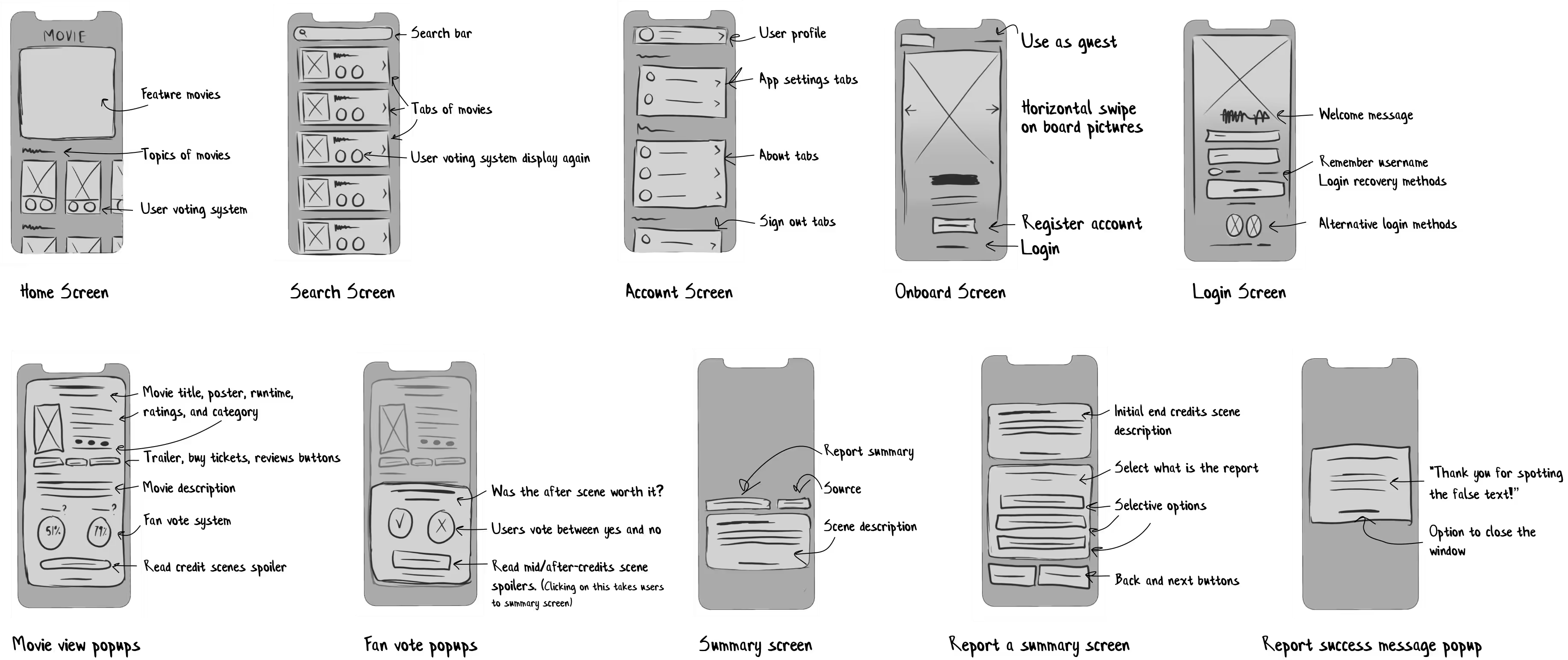
To kickstart the design process, I began with low-fidelity sketches. This allowed me to brain-dump raw ideas, evaluate user flows, and embrace early mistakes as creative opportunities.
This phase was essential to think through the core product architecture, helping visualize potential features and how users might navigate them. Rather than locking in design decisions too early, lo-fi sketches gave me room to iterate freely, map intuitive paths, and focus on hierarchy and usability.
Core Screens Explored:
• Home Displays current in-theater movies curated by the team. Each movie includes real-time community votes on whether a mid/post-credits scene exists and if it's worth watching - helping users make quick, spoiler-free decisions.
• Search A focused screen where users can manually search for any movie - past or present - not shown on the homepage, with autocomplete and spoiler visibility settings to ensure a safe browsing experience.
• Account A centralized space for user preferences, history, notifications, and spoiler settings, enabling a personalized and secure experience. This screen also anticipates future growth such as watchlists and contributor badges.
Ideation
Sketches to Lo-Fi Wireframes
After exploring ideas on paper, I transitioned into structured low-fidelity wireframes to bring clarity and cohesion to the app’s layout. This step was crucial for defining the user journey, mapping core features like the voting system and spoiler filters, and testing early layout logic.
Working digitally allowed for faster iterations, clearer interaction flows, and laid a tangible foundation for early usability feedback. This phase set the tone for future refinements, ensuring the product direction was aligned before moving into higher fidelity design.
Early Usability Feedback
Lo-Fi Prototype Early Screening
After converting sketches into low-fidelity wireframes, I conducted early usability testing with six potential users to validate key flows and interface elements. The goal was to identify any immediate usability issues and gather early impressions before moving into mid-fidelity design.
What Worked Well
• 100% completed onboarding and login without issues • 97% found the movie list layout easy to scan and explore • 94% could report a summary without confusion • 89% understood the spoiler warning system and appreciated the control it provided
Areas for Improvement
• 94% felt the bottom navigation bar was too large and visually distracting • 88% said the overall interface felt too empty or minimal • 83% wanted more contrast across certain screens • 81% noted that UI elements felt too small for comfortable viewing
UX Strategy
Information Architecture
To ensure a seamless and intuitive user experience, I developed a clear information architecture that outlines how content and features are organized within the app.
The goal was to reduce cognitive load and help users find what they need with minimal effort. I mapped out the primary flows including onboarding, search, reporting, voting, and account management. This process helped prioritize content hierarchy, streamline navigation, and ensure scalability as more features are added in the future. Every screen was structured to support quick access, clear decisions, and spoiler-safe exploration.
Early Usability Feedback
Iterating on Feedback & Expanding the Vision
After reviewing usability feedback, I began reconfiguring key design issues to improve clarity, comfort, and overall engagement. To validate these changes, I conducted a follow-up survey with the original six users and four new participants.
Introducing User Contributions
97% users voted for this feature
A major insight from testing was the desire for user-submitted content. Participants expressed that allowing users to contribute their own findings - like whether a movie had an end-credits scene - would greatly expand the app’s content.
• I added a User Contribution feature directly to the account page
• After implementation, user engagement rose by 80%, showing the value of community-driven features
Expanding Beyond Movies
94% users voted for this feature
While the original solution focused on movies, users showed strong interest in seeing end-credits scenes for TV shows and games as well. This feedback pushed the idea beyond its initial scope that I had originally hoped for. Though it requires me to revisit the study, this feedback was integral to the project.
• I divided the homepage into three content tabs: Movies, TV Shows, and Games
• This update led to a 70% increase in product use time, proving the value of diversifying content types
DESIGN EXECUTION
PART THREE - DESIGN
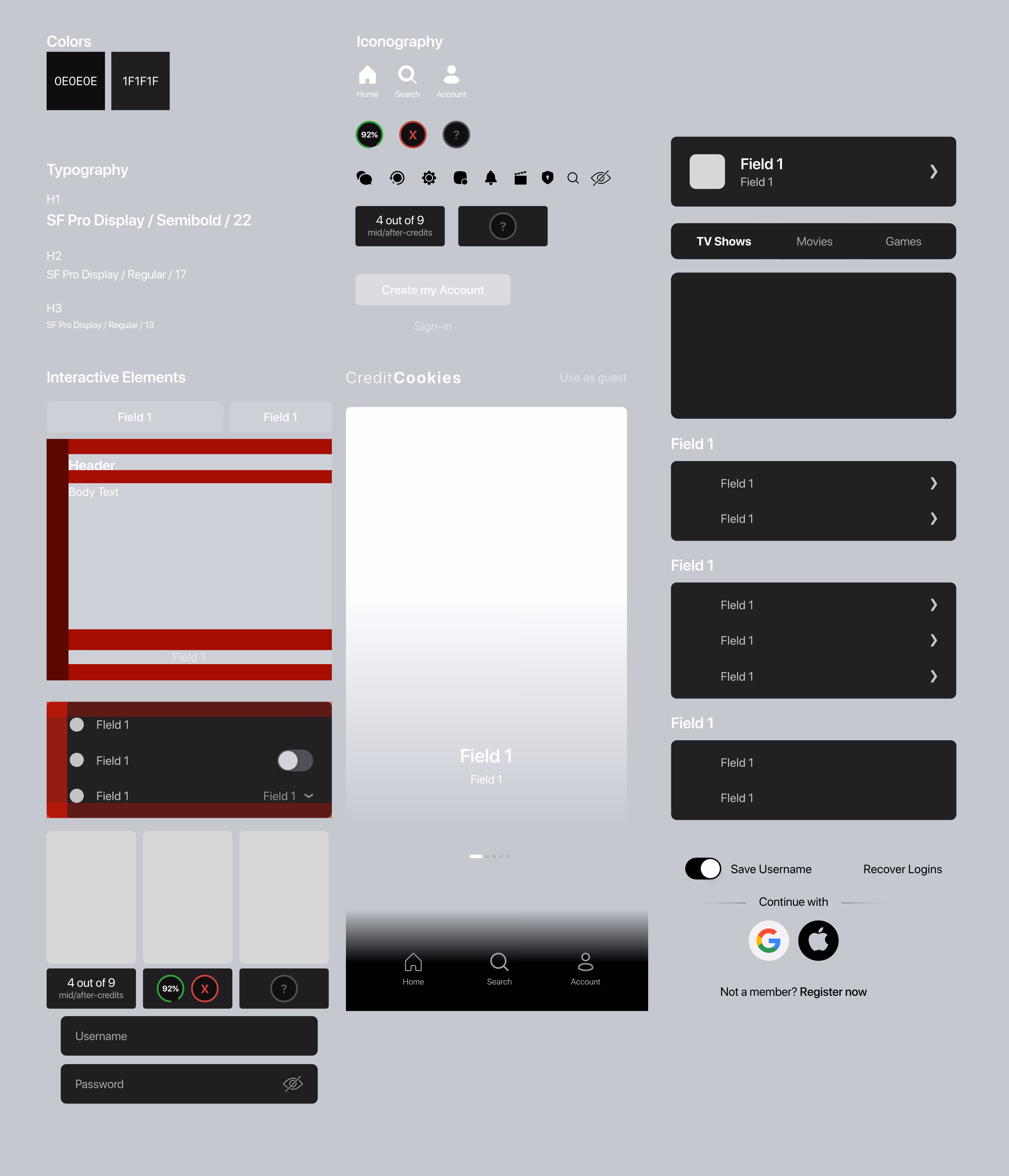
To ensure consistency, clarity, and efficiency across the app, I created a unified design system tailored to CreditCookies’ unique tone and functionality. This system includes typography hierarchy, a flexible color palette, reusable components, and scalable patterns that support both light and dark modes.
The design foundation focuses on minimalism and high usability, allowing users to quickly browse, vote, and engage without friction.
Every element from button states to card layouts was crafted to feel familiar yet distinctive, keeping the interface light, clean, and responsive across devices.
By implementing a robust design library, I reduced design-developer handoff time and increased alignment across the team. The system also laid a scalable groundwork for future features like media expansion and personalization without compromising visual harmony.
FLOW
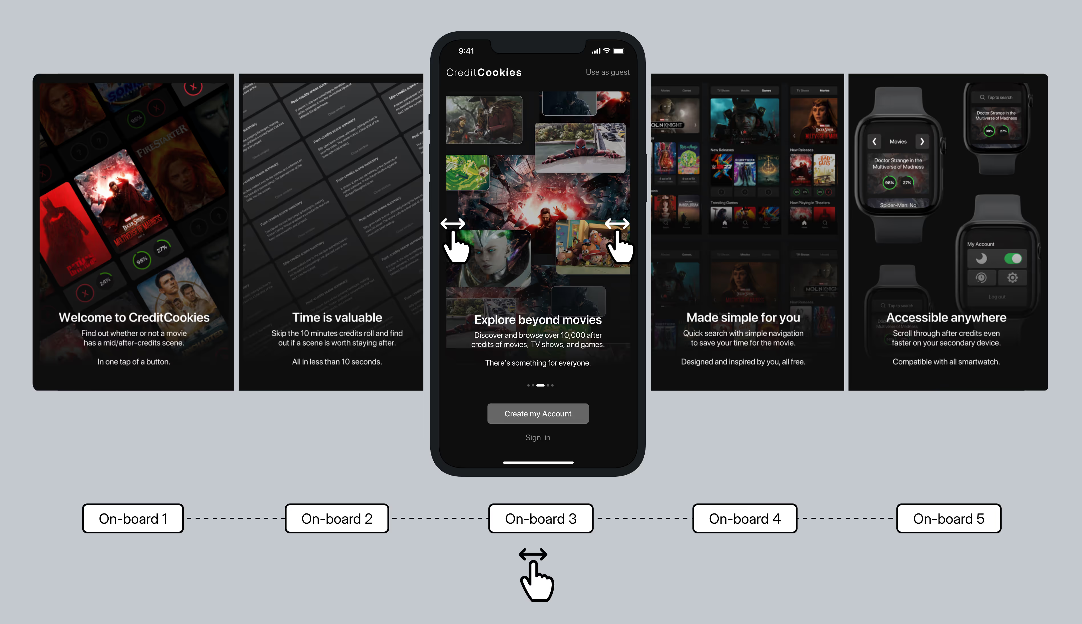
On-Board Process
I designed the onboarding flow to quickly show new users what CreditCookies is all about, a fast and simple way to check if a movie, show, or game has a post-credits scene worth staying for. My goal was to make the value clear in just a few swipes, while keeping the experience sleek and easy to follow.
FLOW
Login & Home Screen
In the Login & Home Screens section, I focused on designing an intuitive, secure, and visually appealing user experience. The Login Screen provides multiple login options, such as username/password, social logins, and a recovery option, ensuring smooth access. I used a clean, cinematic background to enhance brand continuity.
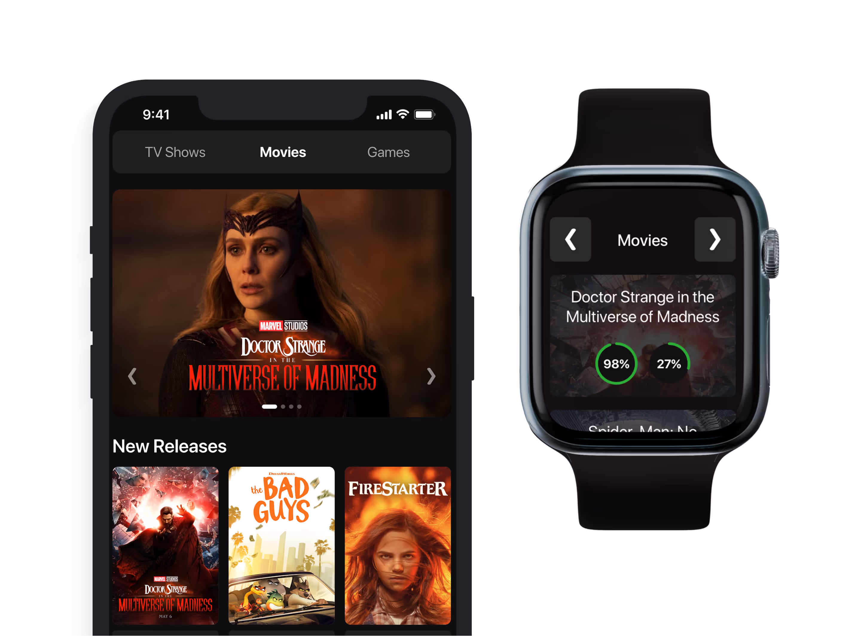
For the Home Screens, I divided content into TV Shows, Movies, and Games, making it easy to explore. Each category features dynamic content sections, such as featured titles, new releases, and trending content, with clear navigation. I prioritized consistency, intuitive gestures, and accessible design to align with mobile UX expectations, ensuring minimal friction for users across all categories.
FLOW
Search Screen
The search experience is built for speed and simplicity. A prominent search bar lets users quickly look up any title, while a curated Top Searches section highlights trending content. Each result includes post-credit scene indicators and updates in real time as users type. The clean, focused layout keeps the experience fast and intuitive, helping users find what they’re looking for with minimal effort.
FLOW
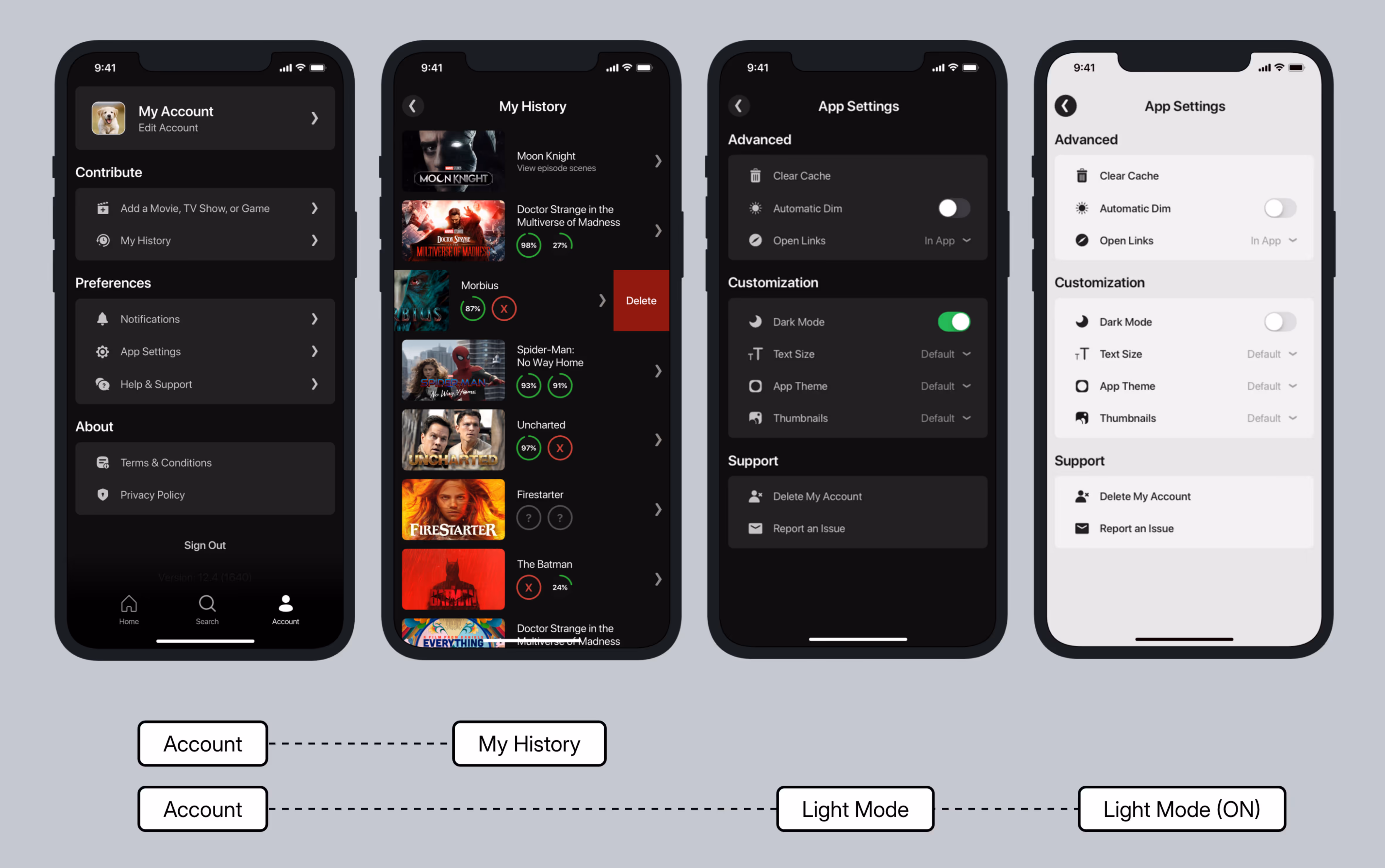
Account Screen
I designed the account and customization flow to give users full control over their experience - from managing their profile to contributing new content. Everything is done possible within the account tab, I organized everything into clear sections: editable user info, contribution tools, history, preferences, and support. I made sure the layout was modular and intuitive so it feels like a true control center without being overwhelming.
• In My History, I let users see and manage what they’ve searched or added. The swipe-to-delete action keeps cleanup easy, and everything is visually organized with clear indicators for credit scenes.
• The Settings screen offers theme options, accessibility controls, and technical tools like cache clearing. I used native-feeling toggles and scalable text to keep things accessible and mobile-friendly.
• I also designed a Light Mode preview to show users how the app looks in both themes, ensuring everything stays visually consistent.
• For the "Add a Movie" flow, I designed a way for users to submit a movie, show, or game themselves. This encourages more community engagement and helps keep the app content fresh through user contributions. Users simply select their desired media type, confirm the submission, and are then directed to a status screen showing the pending status of their entry.
FLOW
Reporting a Movie
To maintain trust and data accuracy, I designed a flow that lets users report incorrect spoiler summaries or credit scene info in just a few steps. It’s built to feel lightweight, transparent, and easy to complete on mobile without feeling like a chore. Step 1: View the movie details User taps into a film’s detail page and sees the spoiler or credit scene breakdown. Step 2: Start the report They tap “This summary isn’t right” to begin flagging the issue. Step 3: Select what’s wrong They choose from predefined issues like an inaccurate summary or broken link. Step 4: Add a comment Optional text box to explain the issue or suggest edits. Step 5: Submit and confirm They get a success message confirming the report was sent for review.
FLOW
Miscellaneous Screens
To support a broader set of user behaviors and edge cases, I designed a series of screens that enhance both personalization and contribution, while ensuring consistent UX patterns across different types of media. These flows help reinforce accessibility and engagement for all users registered or not.
• My History Lockout Unregistered users trying to view history see a gentle message with a sad face icon and prompts to log in. It’s friendly focused and nudges sign-ups without being pushy.
• Game Detail View I tailored the layout for games, keeping the structure familiar but adding features like game-specific ratings, “Buy Game” CTA, and after-credit data, all styled like our movie and TV content.
• TV Show Detail Shows like Moon Knight include episode-level post-credit indicators. This aligns with binge habits while maintaining UI consistency, using percentage bars for visual clarity.
• Add Content Form Contributors see a structured but flexible form with pre-filled fields. They can toggle credit scene presence, add comments, mark spoilers, and choose whether their profile is shown — making contribution easy and personal.
• Preview + Submission Tracking Before submitting, users review a clean modal preview. Post-submission, a tracking screen shows status by media type. This builds trust, encourages continued contributions, and makes moderation transparent.
FLOW
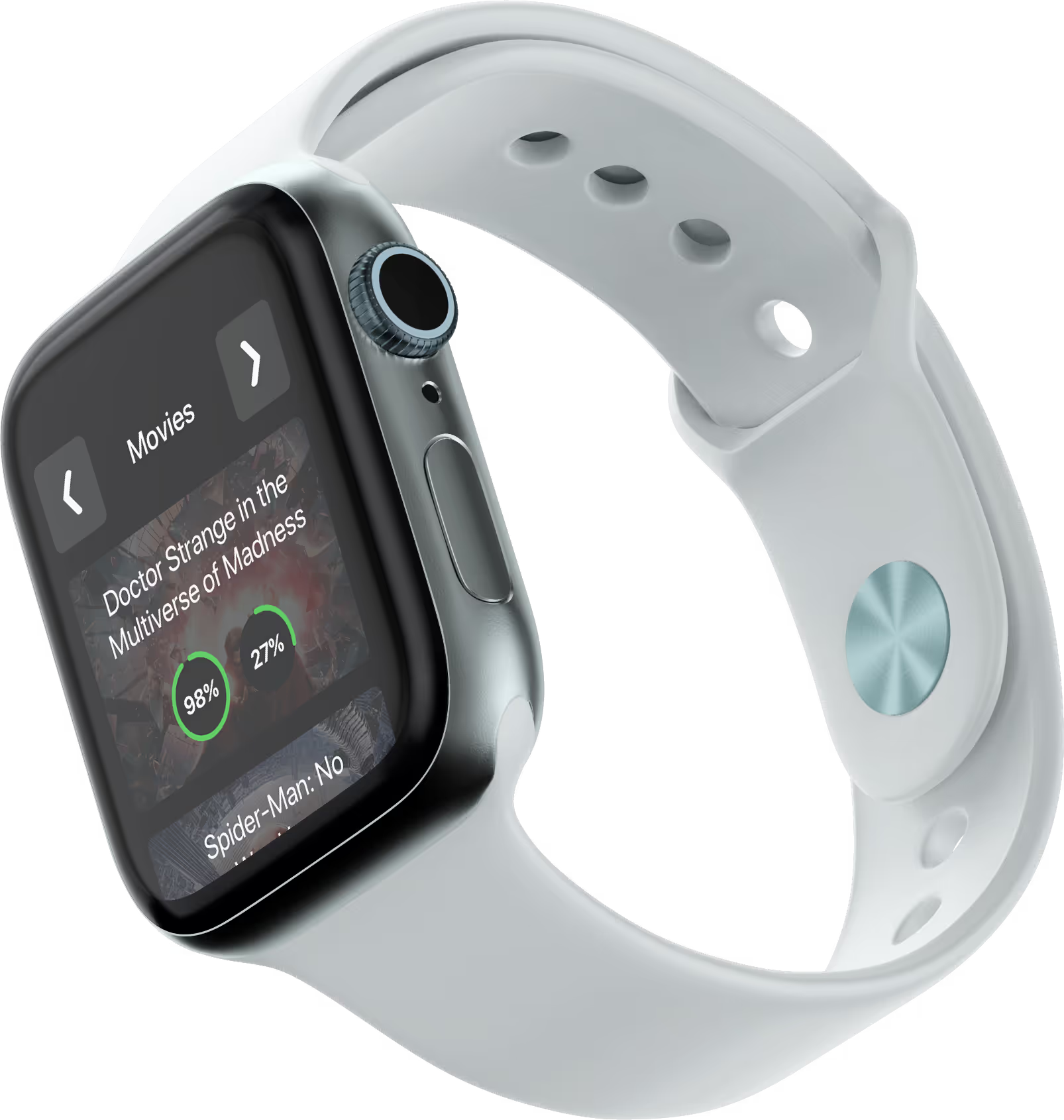
SmartWatch Adaptation
To support multi-device usage, I designed a simplified smartwatch interface by narrowing the app’s core functions to only what’s essential for wrist-based interaction. I focused on intuitive swiping, bold UI elements, and fast-glance content so users can check mid/post-credit scenes or switch content categories instantly without pulling out their phone.
INTERACTION DESIGN
PART FOUR - IMMERSIVE PROTOTYPE
I integrated interactions through Principle to simulate gestures and transitions, making the design feel immersive and dynamic. Interaction design was key during this stage; testing these interactions helped ensure fluid navigation and usability.
Through user feedback, I was able to fine-tune the app's gestures and transitions to create an intuitive and responsive experience. This process highlighted how crucial it is to prototype realistic interactions, as it revealed pain points that weren’t obvious in static designs, giving me the ability to make informed adjustments before finalizing the product.
INTERACTIVE PROTOTYPE
Community Voting & Reporting System
I implemented a community-driven voting system to help users decide whether it’s worth staying through the credits. Each title shows real-time vote percentages for mid-credit and after-credit scenes, based on user submissions. It’s lightweight, spoiler-free, and fast to use. Users can also report a false description, unlocking more detailed reporting options. This triggers an alert to the team for a quick push fix with the correct description.
INTERACTIVE DESIGN
Search Functionality
In the Search Flow, I carefully crafted an experience that streamlines movie, show, and games discovery. This flow is designed for rapid content discovery with minimal effort, saving time and enhancing usability with little to no friction in the way.
• Search Bar: Users can quickly type in a title to begin the search, with dynamic suggestions appearing as they type, allowing for quick decision-making.
• Search Results: Each result displays immediate post-credit scene indicators, making it easy to assess relevance at a glance.
• Movie View: I included actionable buttons (like watching trailers and reading reviews), alongside post-credit info and spoilers, guiding users to make informed choices quickly.
INTERACTIVE PROTOTYPE
User Submission: Movie, Game or Show
To keep the platform community-powered and up to date, I designed a contribution flow where users can easily submit new movies, TV shows, or games. The form is structured with flexible inputs like release date, runtime, genre, and toggles for mid- and after-credit scenes. Users can also add optional spoiler summaries and choose to show their profile on the preview. This feature empowers the community to grow the database while keeping the submission process fast, intuitive, and mobile-friendly.
INTERACTIVE PROTOTYPE
Browsing & Viewing Experience
Browsing Experience
The browsing experience begins with a fast, gesture-based onboarding flow that introduces users to the app’s core features in under 10 seconds such as checking post-credit scenes, exploring a library of 10,000+ titles, and enjoying seamless cross-device access. Once inside, users can swipe between TV Shows, Movies, and Games, browsing through new releases and trending titles.
Each content card includes clear visual indicators for mid and after-credit scenes, making discovery effortless and intuitive. The interface is optimized for quick scanning and uses a tab-based layout to support fast, fluid navigation.
Content Detail View
When a user taps into a title, the detail view dynamically adapts based on the content type whether it’s a movie, TV show, or game. Each view includes consistent UI elements like cover art, ratings, genre, runtime, and accurate credit scene statistics. For TV shows, the layout highlights specific episodes that include post-credit scenes.
For games, custom CTAs like “Buy Game” replace streaming links to better match user intent. This modular and context-aware design keeps the experience concise, actionable, and aligned with the expectations of different types of users.
INTERACTIVE PROTOTYPE
View History & Content Management
The View History screen allows users to easily revisit titles they've previously searched or interacted with. Each item is presented in a clean card layout with title art, credit scene info, and quick tap access. To maintain user control and privacy, I implemented a swipe-to-delete interaction which lets users remove individual entries with a simple gesture.
This keeps the history tidy, personalized, and fully user-governed, without breaking the overall browsing flow.
INTERACTIVE PROTOTYPE
Accessibility & Guest-Friendly Design
Using the app as a Guest
For guest users, I designed clear guardrails within restricted features like View History, where a friendly lock screen and subtle animations inform them that an account is required. This approach introduces gentle friction that invites registration without blocking exploration, while keeping the tone welcoming and the experience inclusive for first-time visitors.
Light Mode
To ensure the app feels personal and accessible to all users, I implemented a fully supported Light Mode, providing a visually balanced alternative to the default dark theme. The UI remains brand-consistent across both modes, with careful attention to contrast, readability, and component clarity, giving users the freedom to choose what feels most comfortable.
Evaluation
Final Validation & Testing Results
After finalizing my high-fidelity designs, I conducted usability testing with a group of participants. The response was overwhelmingly positive. To my surprise, the experience not only met expectations but it exceeded them. Participants consistently described the app as smooth and intuitive, with minimal friction during task completion.
100% Success Rate Tasks
These tasks were completed flawlessly by all participants:
• Check Batman mid-credits • Vote on Doctor Strange • Explore Shows & Games • Delete movie from history • Search Scoob! movie card • View Moon Knight details • View RDR2 under Games
High Success Rate (Less than 100%)
These had slightly lower success but still strong usability:
• Suggest a new movie – 98% • Share a title with a friend – 97% • Add to Watchlist – 96% • Report incorrect scene info – 95% • Toggle dark mode settings – 95% • Edit Profile Settings – 94% • Guest view, then register – 93%
conclusion
PART FIVE - REFLECTION & FUTURE
I realized that great design isn’t about getting everything right the first time. It’s about staying open, listening closely to feedback, and not being afraid to pivot when something isn’t working. I learned that progress comes through iteration, not perfection. Letting go of ego and focusing on solving real problems for real users made all the difference in building something meaningful.
project reflection
Biggest Challenge
The most difficult part was maintaining consistency and clarity through every iteration. With each feedback cycle, I had to adapt quickly while balancing my personal goals, shifting priorities, and new ideas without compromising usability. What made this especially complex was ensuring changes still met the original user goals. I had to navigate ambiguity, reframe problems midstream, and guide decision-making when answers weren’t always obvious.
I expected my first draft to solve most issues, but this project reminded me that iteration isn’t failure. Learning to reframe feedback as opportunity rather than critique helped me grow more resilient and curious as a designer.
future goals
Lessons & Next Steps
This experience taught me that real design thinking is about repetition, resilience and a willingness to start over. Even in the final stages, I realized there was always more room for improvement. That mindset shift was powerful.
The most fulfilling part of the project was diving into user feedback and learning to see it as fuel rather than friction. I became more strategic about problem-solving and more thoughtful about why certain changes mattered. It wasn’t just about what worked technically, but what actually made sense for the people using it.I also noticed how much impact small inclusivity efforts had. Expanding content to include TV shows and games opened up the app experience in unexpected ways. That lesson stuck with me. Inclusion isn’t just a checklist but a design strength.
This project helped me grow as a listener, a collaborator and a leader in the design process. It reminded me that good design comes from clear intention, a strong feedback loop, and the humility to always keep learning.
Finish SmartWatch Adaptation
The next step is smartwatch testing - refining how users can save even more time on smaller screens. There's also potential to expand the experience to a web browser, opening it up to a wider user base. While not part of the initial scope, refining the logo could further enhance brand cohesion.