Hello! My apologies! Currently, this website is only viewable on desktop. The desktop version contains my most recent work, but you’re more than welcome to check out my PDF Portfolio in the meantime. Thank you for understanding!
Learning X'P
UX/UI Design
SaaS Product
Stellantis
UX/UI Design Lead
SaaS Product
Porsche
UX/UI Design Lead
SaaS Product
Volkswagen and Audi
UX/UI Design Lead
SaaS Product
Acclim8s
UX/UI Design
Personal Project
CreditCookies
UX/UI Design
Personal Project
UKG Kronos
UX/UI Design
Personal Project
Problem Framing & Context
Timeline
Two Months
Role
Product Designer
Deliverable
Mobile Application
Tools
Sketch & Principle
I began by investigating why the UKG Kronos mobile app used by over 40 million employees was failing its users. As a former user myself, I drew on firsthand experience to identify design gaps and establish context for a user-centered redesign.
UKG Kronos is a widely used workforce management mobile app with over 40 million users. Despite its scale, the mobile experience significantly lags behind its web counterpart. With a dismal 1.4-star rating across the App Store, common user complaints point to poor usability, unclear UI, and missing key features.
Drawing from my direct experience as an employee who relied on the app for two consecutive summer roles, I recognized significant design and functional shortcomings. These issues affected daily workflows such as checking schedules, logging hours, and reviewing pay stubs.
Ground design solutions in real user feedback, interviews, & usability testing. • Advance User-Centered Decision Making Act as the UX, interaction & visual designer to gain product ownership experience. • Own the Full Product Design Workflow Bring critical web-only features (like pay stub access) into the mobile experience. • Bridge Mobile-Web Functionality Gaps Establish UI patterns & visual clarity across all screens to improve usability & cohesion. • Create a Scalable Mobile Design System
Research
• Competitive Analysis
• User Interviews
• App Audit
• User Journey Mapping
• Contextual Inquiry
UX Audit
• Heuristic Evaluation
• Affinity Mapping
• Usability Analysis
• Pain Point Synthesis
• Design System Review
Redesign
• Wireframing
• UI Design System
• Interaction Design
• Prototype Building
• Information Architecture
Testing
• Usability Testing
• Task Success Measurement
• Feedback Sessions
• Iteration Loops
To ground my redesign in user behavior, I performed a heuristic analysis and conducted qualitative interviews with 10 coworkers. This helped me uncover key pain points like unclear navigation, missing features, and low task success rates.
To establish a foundation for the redesign, I began with a detailed evaluation of the existing UKG Kronos mobile application. This process identified several critical usability breakdowns that directly impacted employee workflows. While I had personal familiarity from using the app myself in past roles, I wanted to ensure my analysis was objective and rooted in broader user feedback.
Disorganized Information Hierarchy
Screen layouts lacked visual grouping and prioritization, making it difficult for users to understand where to focus.
Overwhelming Cognitive Load
The interface presented dense blocks of content with minimal white space, which led to user fatigue and navigational hesitation.
Broken User Objective Flows
Users struggled to complete simple tasks, such as checking their schedule or viewing timecards, due to unclear or inconsistent flows.
Lack of Visual Feedback
Interactive elements provided no confirmation or state changes upon engagement, contributing to user frustration and errors.
Inconsistent Navigation Patterns
The navigation system did not follow expected mobile conventions, often causing users to get lost or unintentionally exit workflows.
Poor Mobile-to-Web Parity
Key features available on the web version (e.g. pay stub access, messaging) were either missing or fragmented in the mobile app.
To better understand where the UKG Kronos mobile app was falling short, I conducted a heuristic evaluation across each major screen using Jakob Nielsen’s usability principles. This allowed me to systematically identify UI/UX violations, information hierarchy issues, and functional breakdowns that negatively impact users.

I paid close attention to visual inconsistencies, unclear navigation structures, and task flows that didn’t align with standard mobile UX patterns. Some of the most frustrating elements included unclear page transitions, missing home buttons, and the absence of touch feedback on key actions.

Below are my findings based on the evaluation:
Top Pain Points Summary:
No Error Prevention / Undo Options
• Critical actions (logout, cancel, delete) are instant with no confirmations, this was a big major red flag
Unoptimized Touch Interaction
• Tap areas were poorly placed (e.g., under thumbs), lacked drag-to-cancel logic, and caused frequent mis-taps
Low Visibility of System Status
• Users were left in the dark about current task states or whether a request was submitted successfully
Poor Visual Hierarchy
• Text and icons lack grouping, spacing, and logic, creating a stressful and confusing navigation system
Lack of Mobile-Friendly Structure
• Touch zones and visual spacing are not optimized for handheld use
Misaligned Design Systems
• Inconsistency between screens creates confusion, steering away retention
No Contextual Feedback
• Users are unsure if tasks succeeded or failed
Overwhelming Interfaces
• Information is densely packed with no clear flow
Lots of Navigation Ambiguity
• Buttons are hidden, mislabeled, or counterintuitive
To ensure I wasn't designing from personal bias alone, I conducted user interviews with ten coworkers: six men and four women between the ages of 32 and 50. These sessions were a mix of in-person and virtual, each lasting around 30–40 minutes.

I structured the interviews to uncover how employees were actually interacting with the app in their daily workflow. My focus was to surface usability pain points, identify missing features, and understand how those issues impacted their productivity and satisfaction.
The way the hours are listed makes no sense. I have to guess which shift is which. Sometimes I just want to message my coworker about a shift, but there’s no way to do that in here. I press something and nothing happens. Did it go through? Did it not? I have no idea. I hit cancel by accident and it’s gone. No warning. Honestly, I only open the app to check my pay but it’s not even there. Half the time I don’t even know where I am in the app. I just tap until I find what I need.
Key Insights:

Low confidence in task completion: Over half of the participants shared they often weren’t sure if they had completed a task successfully due to a lack of confirmation or feedback within the app.

Core feature missing: Almost every participant said they mainly log in to check pay stubs—yet this feature isn’t available in the mobile app.

Navigation confusion: Most users couldn’t get from point A to B without feeling lost or frustrated. Many said they preferred the desktop version because the app felt too difficult to use.

Communication barriers: Several users mentioned wanting a built-in chat feature to message coworkers more easily.

Timecard confusion: Nearly all participants struggled to read their timecards because hours were visually jumbled across days, causing disorientation.

Accidental actions: A recurring issue was the inability to cancel accidental taps, especially when clicking the logout button—leading to unnecessary friction.
After conducting 10 user interviews and auditing over 15 screens across mobile and web, I identified 7 major usability violations that directly impacted task success, user trust, and overall satisfaction.

Here’s a breakdown of the most critical issues, framed against Jakob Nielsen’s usability heuristics:
Poor hierarchy (10/10 users)
Misaligned visuals made screens hard to scan or understand
Confusing layouts (8/10):
Timecard and Schedule pages has similar structure
No successful feedback (6/10)
No confirmation, users unsure if tasks were complete
Dead-end navigation (4/10)
Missing home/back buttons forced app restarts
No undo (7/10)
Accidental taps like canceling a request couldn’t be reversed
Unclear icons (5/10)
Unlabeled icons led to hesitation or missed features
No cancel (6/10)
Accidental click gives no chance to cancel, causing frustrations
I transitioned from research into defining early-stage solutions, using wireframes and system patterns to explore and map out improvements. These foundations helped guide scalable, user-centered design decisions throughout the process.
Before jumping into the redesign process, I mapped out key user flows to ensure the redesign addressed the right problems. I sketched out low-fidelity wireframes focused on core tasks like checking timecards, submitting time off, and viewing schedules.

The goal here is to focus on taking user feedback and pain points and turning that into a polished product.
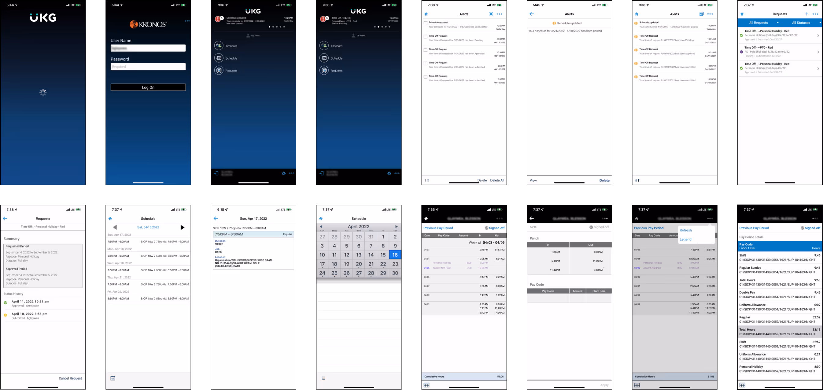
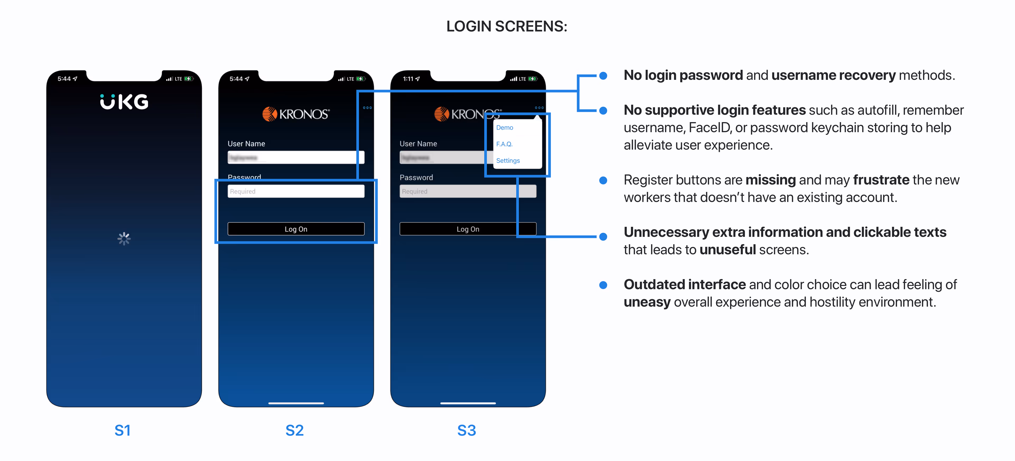
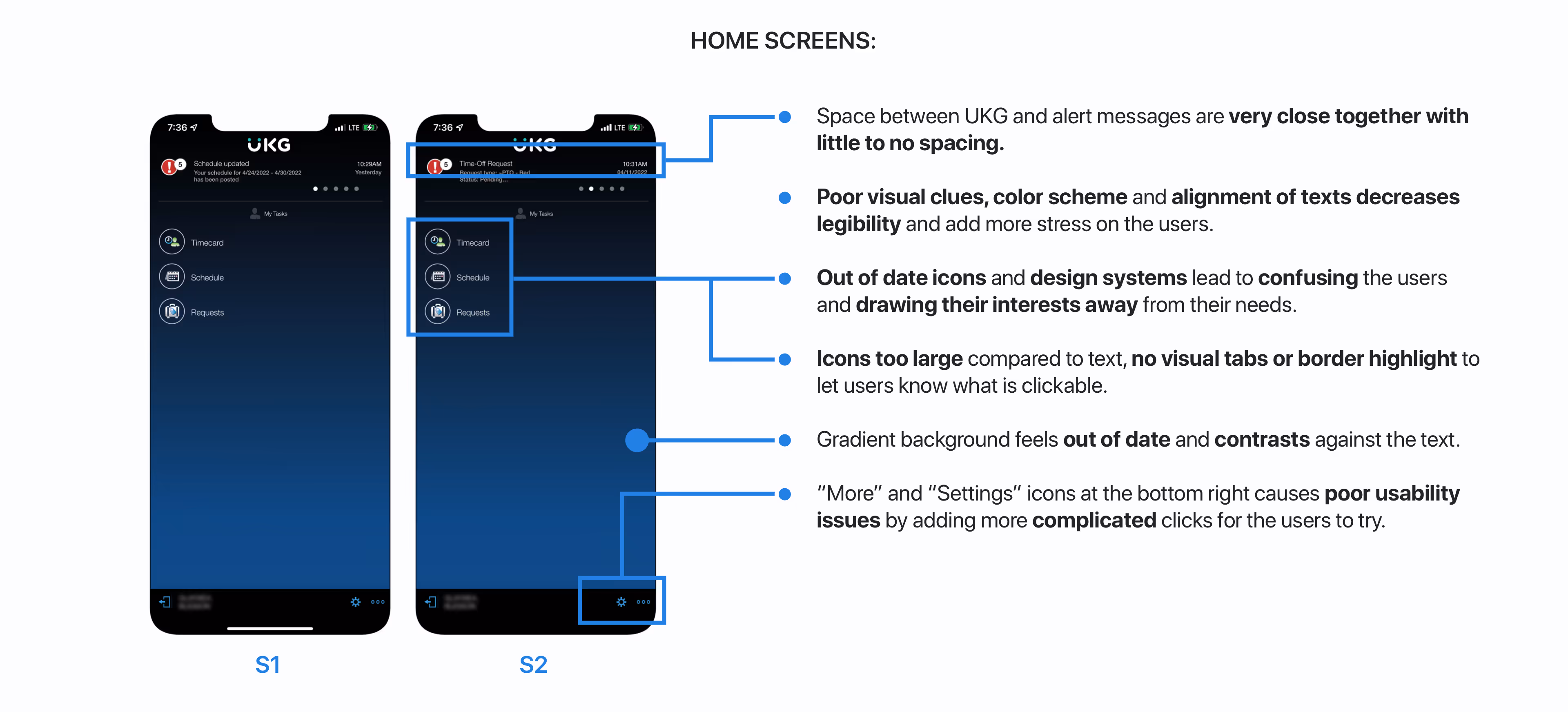
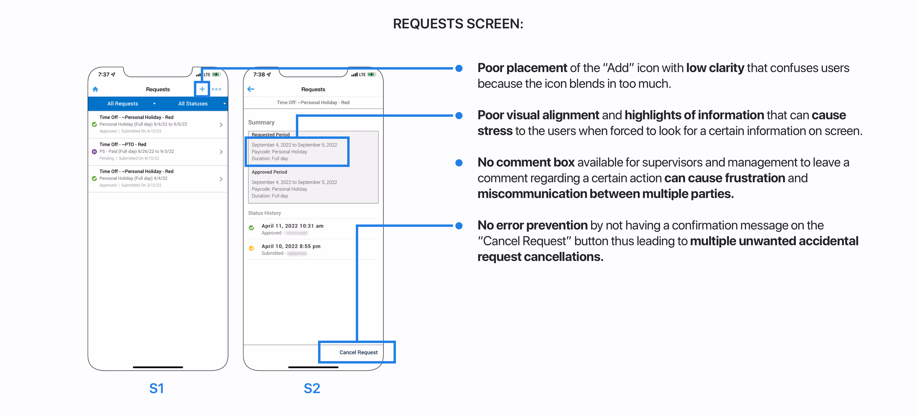
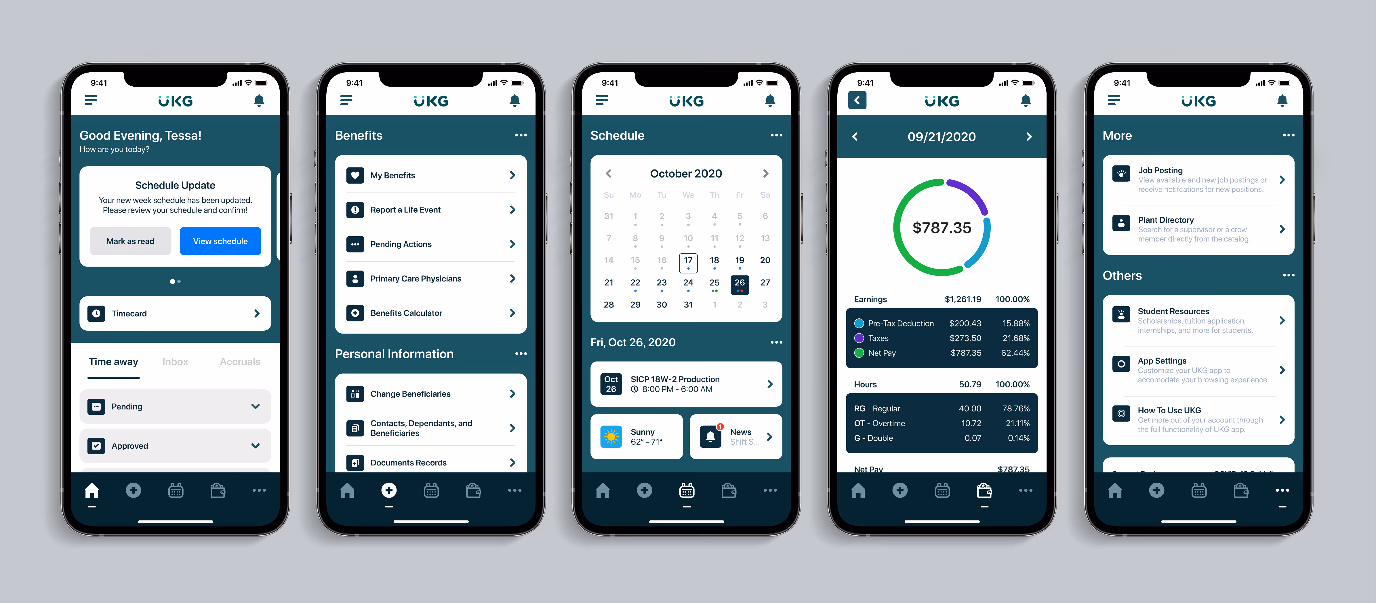
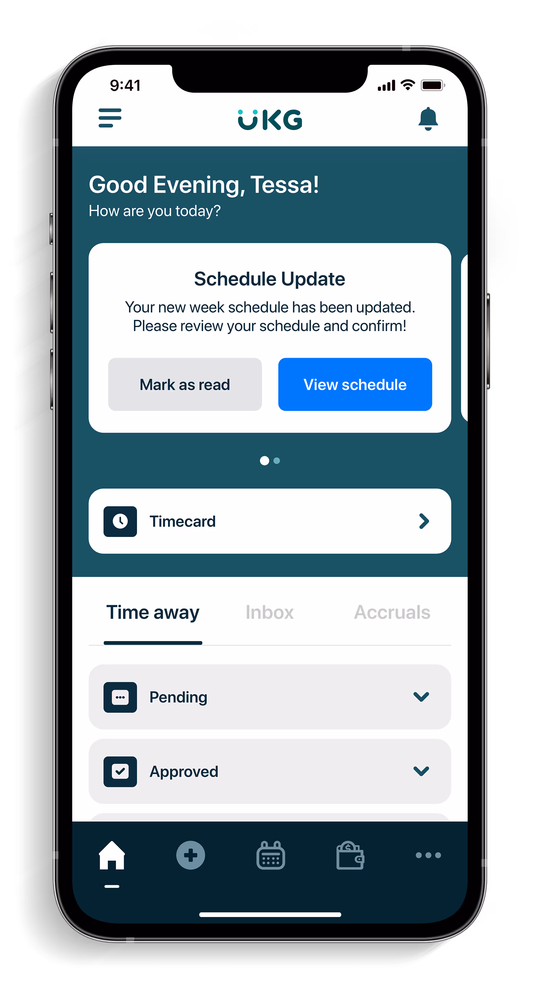
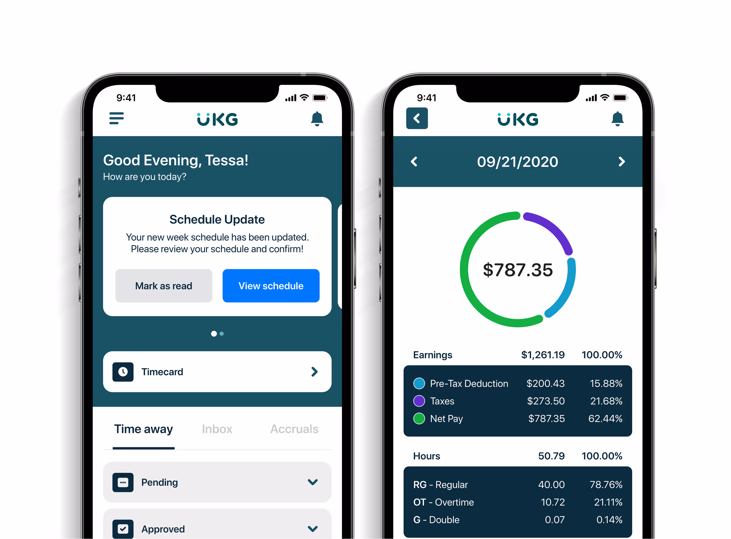
Rather than designing screen by screen, I built out reusable components to make sure every visual and interactive element aligned with the core experience: simple, functional, and human-centered. This design system serves as a response to the usability breakdowns I uncovered earlier.

By defining the system upfront, I saved time during iteration and ensured my designs were accessible, clean, and consistent across all screens.

Here are my top focus:

• Typography: I selected clear, readable type with strong hierarchy to support fast scanning and reduce visual fatigue.

‍• Color system: I introduced an accessible palette with better contrast ratios to improve clarity, especially for reading timecards and schedules.

‍• Buttons & forms: I established consistent spacing, sizes, and states (default, hover, disabled) to give users clearer feedback and reduce accidental taps.

‍• Iconography: I replaced vague or redundant icons with clearer, labeled alternatives to reduce hesitation and guesswork.

Feedback & alerts: I introduced toast messages, confirmations, and visual feedback for common actions like submitting a request or logging out, something users specifically asked for.
With the design system in place and user flows mapped, I transitioned into high-fidelity designs. My focus was on visual clarity, accessible UI patterns, and integrating key features like pay stubs and time-off requests into the mobile experience. Every component was guided by the system I created and validated against earlier usability pain points.

I redesigned the login, home, alert, timecard, schedule, and requests screens with a clean visual hierarchy, added accessibility-focused features like shift summaries and comment options, and prioritized clarity in navigation. Many updates were inspired by the missing functionality users pointed out like saving login info, previewing pay stubs, and confirming actions.

Each component followed the visual system I built earlier, allowing for faster iteration and a more unified experience across the app. Every decision I made was grounded in usability feedback and centered around helping users complete tasks more confidently, with less friction.
I redesigned the onboarding and login flow to make the experience faster, more intuitive, and more secure.

The original app lacked basic features like username recovery, password visibility, Face ID, or even a register button, which frustrated new users and slowed down returning ones.

I introduced key updates such as save username, Face ID login, password keychain support, and an account registration option for first-time users.

I also added a quick app guide during onboarding to help users understand key features right away.
As part of the high-fidelity redesign, I restructured the core navigation into five clear, functional tabs: Home, Benefits, Schedule, Earnings, and More. Each tab was mapped to users’ most frequent tasks, reducing cognitive load and improving access to key features.
01. Home
Employees land on this screen upon logging in.

The Home screen consists of showing the notification display, timecard view, time away, inbox and statistics viewing. Clicking on the option will take the users to their corresponding screens.
02. Benefits
Users land on this screen after clicking on the Benefits icon on the nav bar.

Benefits screen allows users to view records and make edits to any benefits and beneficiaries on the users’ behalf.
03. Schedule
sers land on this screen after clicking on the Calendar icon on the nav bar.

The Calendar screen lets users view their shift hours and make necessary time off requests, users can also see the news and weather for any updates upon the day of their shift.
04. Earnings
Users land on this screen after clicking on the Earnings icon on the nav bar.

The Earnings screen has the employees’ pay period, and gives users the option to edit their bank information as well as view any tax documents related.
05. More
Users land on this screen after clicking on the More icon on the nav bar.

The More screen has additional contents that won’t fit within the other screens. Users can access settings, directory, view job posting, and other matters.
• Added save username, recovery methods, view password, and register account to speed up login time.

Added UKG Kronos app guide to ensure users that they can maximize the potential within the app and its features.
Multi Before After Sliders
• Added a greeting message that welcomes users to create empathy and a safe user browsing experience.

• Added a horizontal swipe notification alert display to ensure that users do not miss any important news.

• Redesigned “Timecard” tab to fit with ongoing theme and aesthetic.

• Added the option for time away, inbox and statistics that will allow the users to quickly access their requests and points system.

• Hamburger menu contains features that cannot be combined within the bottom navigation bar.

Sorted different tabs and placed them according to their functionality through personal, quick links, and files category.

• Added the search functionality feature for easier accessibility for users to search for what they need.
• Created proper organization by breaking down notification messages corresponding to their delivery time.

Added “Mark all as read” option for one click view on all messages.

• Check mark box allows users to mark messages specifically during a certain timeframe as viewed.

• Color of the notification now corresponds to their perspective actions.

• Added message views as pop ups to ensure an easier viewing experience by prioritizing the message’s subject, time delivered, message details, and the action that the message contains (if applicable) made by the users.

Grouped different categories of messages according to the users’ need for easier access and viewing.
• Redesigned and organized tabs on the “Timecard” screen to fit the correct shift date by displaying start, lunch break and end time.

Added arrow options to let users view and track their history of how many hours they’ve worked.

Added option to view week report to summarize user’s full worked week.

Highlight necessary information (S2) such as work hours to alert users more on what is important.

Added the ability to view users’ shifts (S2) in details and allow users to leave and submit comments.

Prioritize important information through visual clarity by presenting clear and simple messages.
• Redesigned entire interface of “Schedule” screen to feel more modern and simple to help alleviate users’ tasks.

Added arrow navigation to allow users quickly move from one date to another without going back.

Added shift display, weather tracking, and news to prioritize user needs and prevent leaving the app.

Help easing users navigation and tasks by adding call-in and request cover options to save time.

Displaying proper shift info with coworkers on shift (S2) to keep users well informed at all times.

Pop up menu contains list of useful tools (S3) and key legends to help increase employees experience.
• Redesigned “Requests” page interface and categorized each request based on their specific kinds.

Redesigned requests summary page (S2) as pop ups to allow users to quickly exit and navigate easier through different requests.

Added status bar to indicate the current status of the user request.

Transformed the “add” button into a “create a new request” button with proper visual highlights to add more context and for easier finding.

• Added
filter tabs to help users quickly sort through their requests.
I designed the shift swapping flow to simplify one of the most frustrating parts of workforce scheduling. In the original app, users had no clear way to request coverage or respond to swap offers.

The redesign purpose was to aim for a cleaner experience where users can view eligible coworkers, send swap requests with custom notes, and track the status of each request in real time.

I also added confirmation messages and a clear request history so users always know where things stand.

The goal was to reduce back-and-forth with managers and give employees more control over their schedules all while keeping the interaction lightweight and mobile-friendly.
I redesigned the request flow to feel more intentional and user-friendly. From the timecard screen, users can view detailed shift data and submit contextual comments tied directly to a specific day.

Once submitted, users get immediate confirmation feedback, something that was previously missing and led to confusion.

I also introduced a dedicated "Request Cover" screen where users can select replacement shifts, add context, and receive submission feedback within a clean, responsive interface.
The original app didn’t support time off requests, users were forced to log in through the desktop site just to submit one.

Not only was this inconvenient, but it also excluded users who didn’t have access to a computer or laptop, which is common in hourly and shift-based roles.

I incorporated the ability to submit time off requests directly through the mobile app, making the process more inclusive and accessible for all employees.

Users can now select specific dates, add notes, and get real-time updates on request status all from their phone.

This change removes unnecessary barriers, reduces manager back-and-forth, and empowers users to manage their schedule without friction.
Previously, users couldn’t access their full paystubs or earnings breakdown through the mobile app, forcing them to switch to a desktop version just to see basic payroll information.

Users can also access full pay history, filter by date, and download tax documents.

This new system ensures users have full control over their financial information without needing the desktop version.
I redesigned the Earnings section to make financial data accessible, clear, and mobile-friendly.

I introduced a visual breakdown of pay including pre-tax deductions, taxes, and net pay, supported by a clean chart that gives users a quick snapshot of their paycheck.

Users can now view detailed pay periods, including gross pay, taxes, deductions, and net income. I also added options to edit bank information, download tax documents, and filter through pay history with ease.

This flow gives users more control over their financial data without needing a computer, improving trust, accessibility, and overall efficiency in how they manage their pay.
To help users track and manage their time-off and shift swap requests, I redesigned the account overview with a modular layout.

The home screen now surfaces key alerts, pending approvals, and quick action buttons. The inbox clearly separates shift requests from updates, while the time-away tab shows real-time status updates with a visual timeline for each request.

This level of clarity gives users peace of mind when managing requests.
• To help users track and manage their time-off and shift swap requests, I redesigned the account overview with a modular layout.

• The home screen now surfaces key alerts, pending approvals, and quick action buttons. The inbox clearly separates shift requests from updates, while the time-away tab shows real-time status updates with a visual timeline for each request.

• This level of clarity gives users peace of mind when managing requests.
I introduced a quick-dismiss feature that lets users mark news or alert messages as seen, helping them clear out old or irrelevant updates from the home feed.

This not only reduces visual clutter but also keeps their workspace focused and up to date.

To prevent accidental dismissals, I added an undo button that appears immediately after an action is taken, giving users a short window to reverse it.

This small interaction adds a layer of forgiveness and control, allowing users to manage their notifications confidently without fear of making a mistake. It's a lightweight improvement that plays a big role in streamlining the daily experience.
In the original app, there was no way for employees to clarify or appeal unusual shift entries, like late lunches or missing break times. This often led to confusion, unnecessary manager back-and-forth, and delayed corrections on timecards.

I added a feature that lets users submit comments directly on their timecard entries, giving them space to explain situations like a late lunch or incorrect punch.

These comments are sent to supervisors for review, keeping the conversation in one place and reducing the need for outside communication.

This feature improves accountability, transparency, and trust between employees and management while making the process faster and less stressful for both sides.
These supporting screens cover specialized flows like request summaries and detailed shift info. I added confirmation messages, cleaner alignment, and stronger affordances for interactions like commenting or editing a request.

The "Create a New Request" action is clearly labeled and accessible from the bottom CTA, streamlining the process for repeat users.
These included button states, hover feedback, swipe gestures, and quick tap responses that help guide users through their actions without second guessing.

I added confirmation prompts for critical actions like canceling requests or logging out, as well as visual feedback for button presses to reduce accidental taps.

These subtle but intentional improvements create a smoother, more responsive experience that helps users feel confident and in control, even during fast interactions.
To validate my redesign, I conducted in-person usability testing with the same 10 participants from the interview phase. I walked each person through a prototype with task-based prompts that mirrored real employee actions, like checking a timecard, viewing a pay stub, or submitting a time-off request.

Each task was designed to test specific improvements I made from information clarity to interaction feedback. I gradually increased task complexity to observe how well users navigated the flow on their own.

Here are my results:
10 out of 10
users were able to locate and interact with the main pages and buttons
9 out of 10
could view their pay stub and dismiss notifications successfully,
8 out of 10
successfully opened and reviewed a shift, check for shift schedules and requests
7 out of 10
accepted a shift swap or left a comment on their timecard screen
7 out of 10
found the time-off submission and the legend key, and review requests within shifts
1 out of 10
user needed clarification mid-task because of a language barrier
These numbers showed a dramatic improvement in clarity, navigation, and task completion compared to the original app. The confirmation messages, reorganized screens, and stronger visual hierarchy played a big role in reducing confusion and increasing user confidence.

The testing not only confirmed that my solutions worked, but also gave me a few final insights I could carry into future iterations. Overall, the redesigned experience helped users complete their tasks faster, with less guesswork and more control.
After finalizing the full experience from micro-interactions to usability testing, it was time to step back and reflect. This project was not just about redesigning an app but was about solving real problems with intention. I learned how to listen more closely, think in systems, and make design decisions that genuinely improve people’s day-to-day experience.
One of the toughest parts of this project was navigating the balance between user needs and limited data. I only had access to feedback from ten participants, which made it difficult to predict how certain features might scale. Still, I had to make executive decisions like bringing key desktop features into the mobile experience because they aligned with what users repeatedly asked for.

Another challenge was staying grounded in the “why” behind every decision. Throughout the process, I pushed myself to ensure every design choice was tied to a real pain point, not just aesthetics. That focus kept the project on track, even when it meant challenging early assumptions.
This project taught me the impact of user-centered design when paired with clarity and consistency. What started as a visual update evolved into a full UX rethink and it made me fall deeper in love with product design.

I saw firsthand how even small improvements like layout adjustments or confirmation states can build trust and save users time. These details added up to something bigger: a smoother, more intuitive experience.Most of all, I learned that design is never finished.

There’s always more to learn, more to test, and more to improve. That mindset drives everything I do as a designer and it’s what keeps me excited for what’s next.