Hello! My apologies! Currently, this website is only viewable on desktop. The desktop version contains my most recent work, but you’re more than welcome to check out my PDF Portfolio in the meantime. Thank you for understanding!
Premium vehicle comparison dashboard for Porsche’s global teams.
Research
PART ONE - DISCOVERY
Timeline
Six Months
Role
Product Designer
Deliverable
Desktop & Mobile
Tools
Adobe XD
When I was brought on to lead the Porsche VCT project, there was no prior system in place. The goal was clear: build a seamless internal tool for Porsche teams and clients to compare multiple vehicle models across detailed specs like drivetrain, performance, and design.
Our users included internal teams in product, marketing, and dealer services. I quickly realized that we had to understand not just how users compared vehicles but how Porsche wanted that experience to reflect the brand's clean, powerful, and refined objective motto.
CONTEXT
Business & User Context
Before VCT, Porsche teams relied on PDFs and spreadsheets that were time-consuming and often inconsistent across regions.
This tool needed to unify vehicle evaluation and support real-time data pulled directly from internal systems. It was designed to help internal staff compare performance, pricing, trims, and specs across any Porsche model and sometimes even competitive makes. The solution had to be enterprise-grade, mobile-compatible, and reflect the premium Porsche brand.
From day one, I owned the UX foundation, mapped critical flows, led UI execution, and ensured every step of the product aligned with both development constraints and internal launch timelines.
We focused on understanding how users currently compared vehicles and what friction they experienced using formats like PDFs and spreadsheets.
Each interview revealed real-world behaviors, including how teams prioritized specs and accessed tools in the field when presenting comparisons to clients. These insights directly shaped the dashboard’s structure and reinforced our mobile-first design considerations.
User Interviewed
• Interviewed 6 internal team leads from different departments • Identified key frustrations with current comparison methods • Mapped daily flows and use cases
Pain Points
• Constant tab-switching across specs • Difficulty tracking multiple comparisons in one session • Internal-only models could not be filtered or toggled
MARKET SCAN
Competitive Analysis
To align Porsche’s Vehicle Comparison Tool with market expectations while elevating the luxury experience, I conducted a focused analysis of five core features observed in competitor tools such as Tesla, BMW, Mercedes, and Edmunds.
Porsche’s approach needed to strike a balance between clarity, mobile flexibility, and spec depth, all while maintaining a visually elegant interface. I evaluated each competitor based on usability patterns, data clarity, and design execution across both desktop and mobile experiences.
PROBLEM FRAMING
PART TWO - DEFINITION
Porsche users need a way to compare vehicles before making a purchase because there was no existing internal tool that supported this workflow.
Users Need:
Mulitple Comparison
Compare multiple vehicle trims and models side-by-side
Expandable Categories
Expand and collapse feature categories for focused reading
Manage Vehicles
Easily add, edit, or delete selected vehicles
Mobile Compatibility
Mobile-friendly comparison for events and field reps
Real-Time Accuracy
Confidence that information is accurate and real-time
Shareable Insights
Ability to export or share comparisons
Business Goal
Porsche defined success as adoption by global internal teams and the ability to standardize vehicle comparisons at scale for client-facing use.
STRUCTURING THROUGH IDEAS
PART THREE - IDEATION
Most of the early work happened fast and rough, using whiteboards, direct questions, and constant iteration. I collaborated closely with the PM and engineers to align on what was technically feasible. While competitive research shaped our direction, the actual structure came from sketching, mapping flows, and testing logic in real time.
COLLABORATION
Whiteboard-First Planning
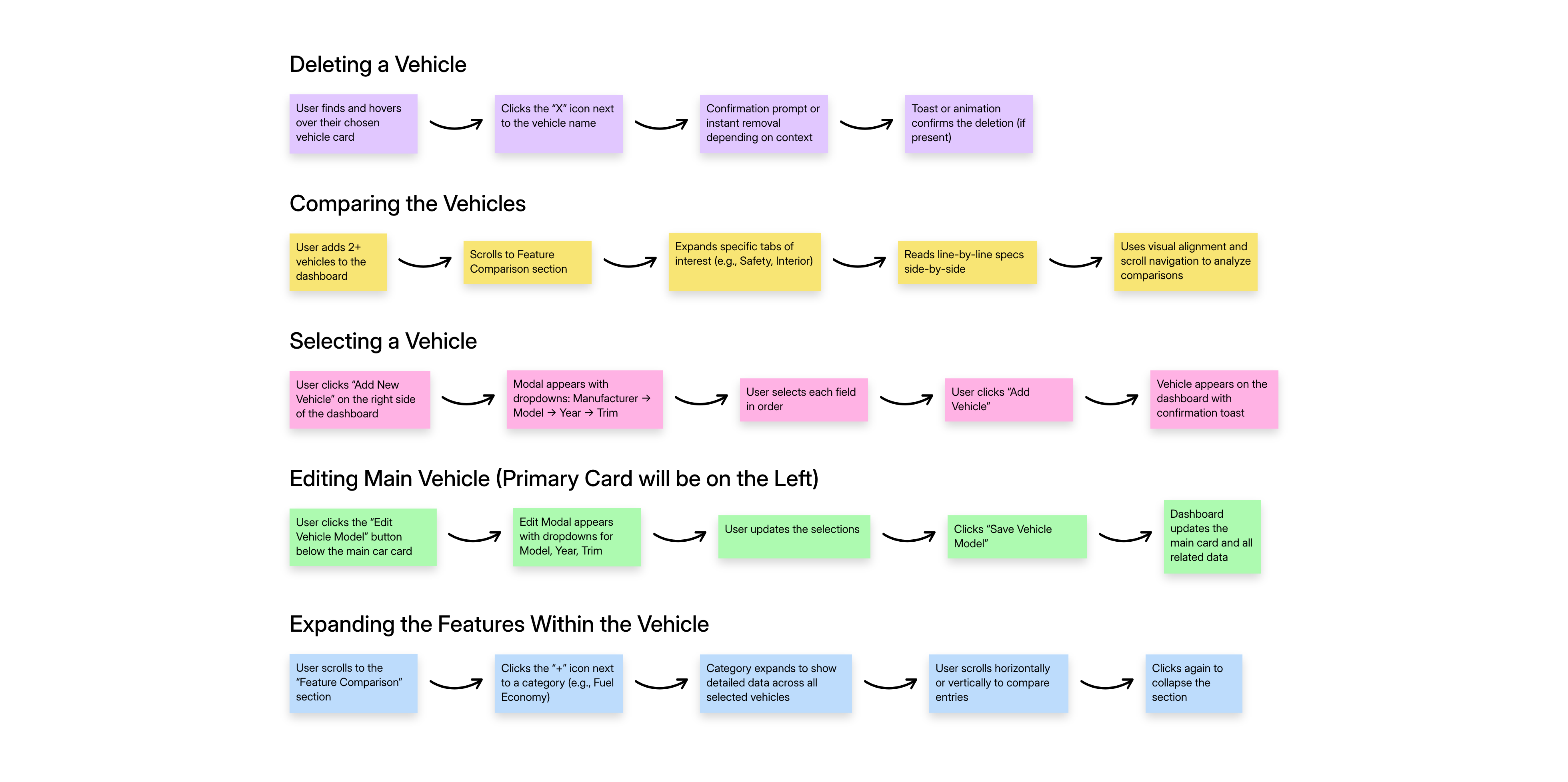
Because of how fast-paced the project was, we didn’t start with traditional wireframes. Instead, we relied on whiteboard sessions as our core planning method.
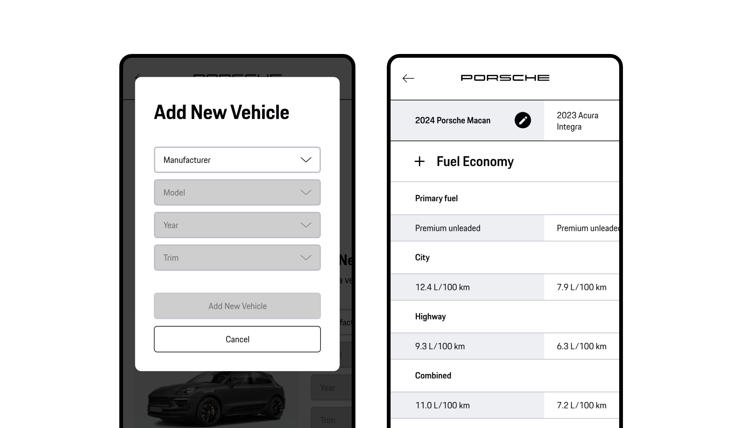
One of our earliest workshops focused on mapping the vehicle selection flow from how users would input Manufacturer, Model, Year, and Trim, to how the selected car would be visually rendered on the dashboard.
These sessions helped us rapidly clarify product behavior and align on logic before any UI components were built.
FLOW PRIORITIES
Information Architecture
We held cross-functional sessions to align on key comparison features and roadmap goals. With input from engineering, QA, and PMs, we prioritized critical sections like Global Tools and Feature Comparison, while keeping areas like Vehicle Cards flexible for iteration.
This shaped an information architecture that balanced user clarity with development feasibility, resulting in a cleaner, more intuitive dashboard flow.
Design execution
PART FOUR - DESIGN
Once I had clarity on what we were building, I focused on systemizing the experience. I built out components for modals, dropdowns, tabs, and alerts to support Porsche’s live API-driven data. Mobile was the toughest as it required rethinking how to fit dense comparison data into small screens without sacrificing clarity or control.
DESIGN SYSTEMS
Component System
I created a component library that supported the real-time, API-driven data needs of the platform. Buttons, tabs, modal structures, toast alerts, and dropdowns were systematized to speed up frontend handoff.
DESIGN THINKING
High-Fidelity Design
The desktop view was designed to support quick scanning across multiple vehicles using a clean, column-based layout. The comparison table features collapsible categories and a clear visual hierarchy to keep dense data organized without overwhelming the user.
Key actions like adding, editing, and removing vehicles are prominently placed to maintain flow and reduce cognitive load during high-volume comparisons.
RESPONSIVE DESIGN
Mobile Focused
Mobile keeps the same core functionality as desktop, but due to limited screen width, a few changes were made: • The vehicle comparison is now horizontally scrollable. • The scroll syncs globally with the feature section below, so scrolling at the top also moves the bottom for easier side-by-side comparison.
Everything else stays the same for a consistent experience.
Usability
PART FIVE - TESTING & VALIDATION
I ran usability tests with internal teams and gathered client feedback to validate the flows from adding vehicles to editing, scrolling, and expanding categories. Every major interaction went through feedback loops with both users and stakeholders, and I made sure to refine small details like mobile tap targets and confirmation states.
These tests covered the full flow of adding, editing, deleting, and comparing vehicles, with a focus on how users interacted with feature categories and navigated the UI on smaller screens. Each session was scenario-based and observed in real time, allowing me to track friction points, UI hesitations, and mobile-specific behavior under real data loads.
Stakeholders were involved in weekly reviews, and a total of 9 to 10 team members signed off on each critical release checkpoint.
Add a New Vehicle to the Dashboard
Tested how users navigate the add vehicle modal, select Manufacturer → Model → Year → Trim, and confirm the vehicle appears with correct data and visual feedback.
Edit an Existing Vehicle from Dashboard
Focused on whether users could successfully update the model or trim of an added vehicle using the edit modal and understand how the dashboard updates in real time.
Remove a Vehicle from Comparison
Evaluated the clarity of the remove action, including recognition of the “X” icon, toast feedback, and whether users accidentally removed the wrong vehicle.
Expand and Navigate Feature Comparison
Assessed how users opened tabs like Fuel, Mechanical, or Safety, scrolled horizontally and interpreted row-based spec comparisons across various vehicles.
Perform All Core Actions on Mobile
Validated the mobile layout for the same flows (add, edit, remove, expand) while ensuring UI elements like buttons, toasts, and dropdowns were accessible and intuitive on smaller screens.
Understand Main Vehicle Hierarchy
Tested if users could recognize that the first vehicle (left-most card) is the main anchor, why it can’t be removed, and how edits to it impact the comparison view.
The results were strong. Every participant achieved 100% task completion, and user satisfaction was 100% based on post-test surveys.
Mobile responsiveness received consistent praise, especially the clarity of comparison rows and the ease of tapping between sections. Based on direct feedback, I refined tap targets, repositioned toast notifications for better scroll visibility, added deletion confirmations, and smoothed tab transitions.
These refinements helped ensure the product felt polished, reliable, and ready for Porsche’s internal global rollout.
PROJECT TAKEAWAYS
PART SIX - LEARNINGS
This was one of the most focused and efficient projects I’ve worked on. I learned how to design in a high-pressure, hi-fi-first environment while keeping UX at the core. Our component system stayed small but flexible. The dashboard scaled seamlessly across desktop and mobile.
Stakeholders were happy and the final product launched successfully across Porsche’s internal network. It’s now used globally to streamline sales, internal education, and client communication.

